
Vladimir Yefimov (1949-2012) was a great deal more than a designer of type faces. Beyond creating new fonts and renewing what survived of the traditions of the Printing Industry Typographic Department (Otdel Nabornikh Shrift, ONSh) of the research-oriented Polygraph Machine-Building organization, he also wrote articles, spoke at professional conferences (and was active in the organizations that sponsored them), organized, with his colleagues, international typographic competitions, taught and trained students and translated and edited books. He helped lay the foundations of the new Russian typography. But he always considered himself, first and foremost, a designer of type
A revolution took place in Russian typography in the early 1990s, but few noticed — or understood the effort needed to keep the revolution civilized. In the global world of type design and typography, civilized means no pirating and high quality: with kerning, styles limited to regular, italic and bold and a standard array of symbols for work in the European languages – small caps, various numeric forms (minuscule, tabular, linear). All very simple, as simple as freedom of speech.
“Perestroika happened, and personal computers appeared. That is when I finally understood the need for the profession,” Yefimov answered, not without irony, in the early 2000s, when asked why he chose type design. “Over the past 10 years the graphic environment has fundamentally changed. <…> And although we don’t have nearly the range of choices in typefaces as in countries that use the Latin alphabet, if we compare the situation with Soviet times, why, we’ve moved in typography essentially from the bronze age to the industrial age. A situation has been created – and this is the main thing – in which there is a demand for new types, which was not the case under socialism.”
Just as there was a need for new typefaces, there was no less a need for a person who would set the bar of taste and conscience, a knowledgeable and observant expert with a balanced point of view that he could explain and defend. Yefimov was that person for several generations of type designers. He never lowered his standards or set aside his sense of responsibility. In practice, he was guided by common sense and deliberately eschewed fashion and one-day wonders. Yefimov seemed almost determined not to stand out. He wrapped himself in the quiet of craft, in, as Mandelshtam wrote, the seductive power of labor.
Yefimov had a rare gift for understanding foreign cultures and art, even when they ran deeply counter to his preferences. Thus he was able to design fonts in the most varied and different styles, like the designers he most admired – Matthew Carter, Gerard Unger and Adrian Frutiger.
Yefimov’s publications, letters and, finally, his entries in Live Journal (DzhDzh) all will help us understand his style. Yefimov’s answers for the latter are, in fact, brief essays, carefully structured, with facts, historical references and sensible infusions of irony. As with so much else, he always found time to answer a question.
Teachers and First Typefaces
Yefimov’s first designs appeared in the late 1970s-early 1980s, and none of the first four typefaces used Cyrillic or Latin alphabets. All were from India: three were Devanagari, and one was Bengali.* Yefimov had, in his words, almost by accident after graduation from the Moscow Polygraphic Institute in 1973, joined the ONSh laboratory for special graphic forms. This was a cramped world, painful in many ways**: because of economic constraints, Soviet society had turned its back on new fonts, which meant that the problem of choosing a typeface at a print shop did not exist. There was nothing to choose from.
But then came the work of such artists in type as Galina Bannikova (1901-1972), Nikolai Kudryashev (1909-1991), Faik Tagirov (1906-1978), Mikhail Rovensky (1902-1996), as well as typefaces from such book designers as Vadim Lazursky (1909-1993) and Solomon Telingater (1903-1969). From them and from one’s colleagues, one could learn. Vladimir Yefimov considered his main teachers to be Lyubov Alekseevna Kuznetsova, the sole Soviet specialist on the writing systems of the Arab world and the person who brought him into ONSh, and Maksim Georgievich Zhukov (in those years the principal artist of the Mir publishing house), with whom he remained close friends.
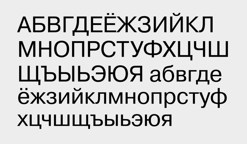
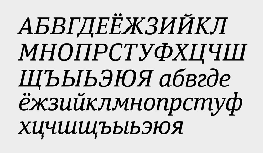
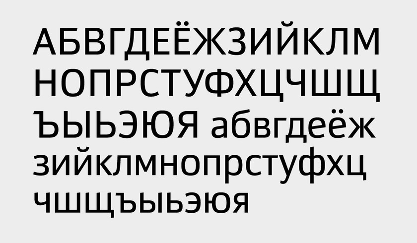
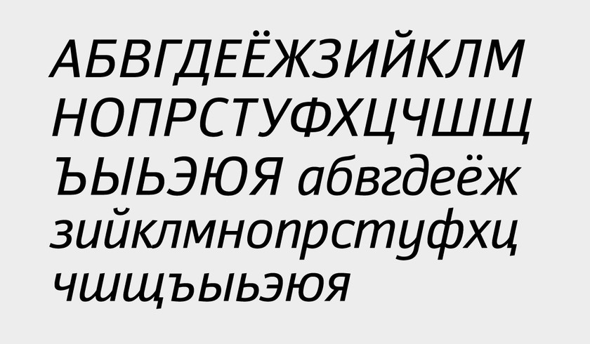
It was while at ONSh in 1985 that Yefimov began work on one of his best known digital types, Pragmatica (which would also be one of the first in the ParaType li-brary). The face was created on commission from the Great Soviet Encyclopedia for its fourth edition. The editors asked that the type be “in the style of Helvetica but with the letter K as in Univers.” The order was unexpected (the encyclopedia had been set in Kudryashskaia Encyclopedia, developed by Nikolai Kudryashyev and Zinaida Maslennikova over the years 1960-1974; it is a face very well adapted to composition in small point sizes), and Vladimir Yefimov used the opportunity to work out a comprehensive Cyrillic typeface in the style of Helvetica. Cyrillic versions of similar typefaces existed. There were, for example, the typefaces produced by Letracet and Monotype and the unauthorized Cyrillic version of Нойе Хаас Гротеск (Max Midinger, Eduard Hofman, 1957), created by Maksim Zhukov and Yury Kurbatov, but these fonts were not models for Pragmatica, according to its creator.
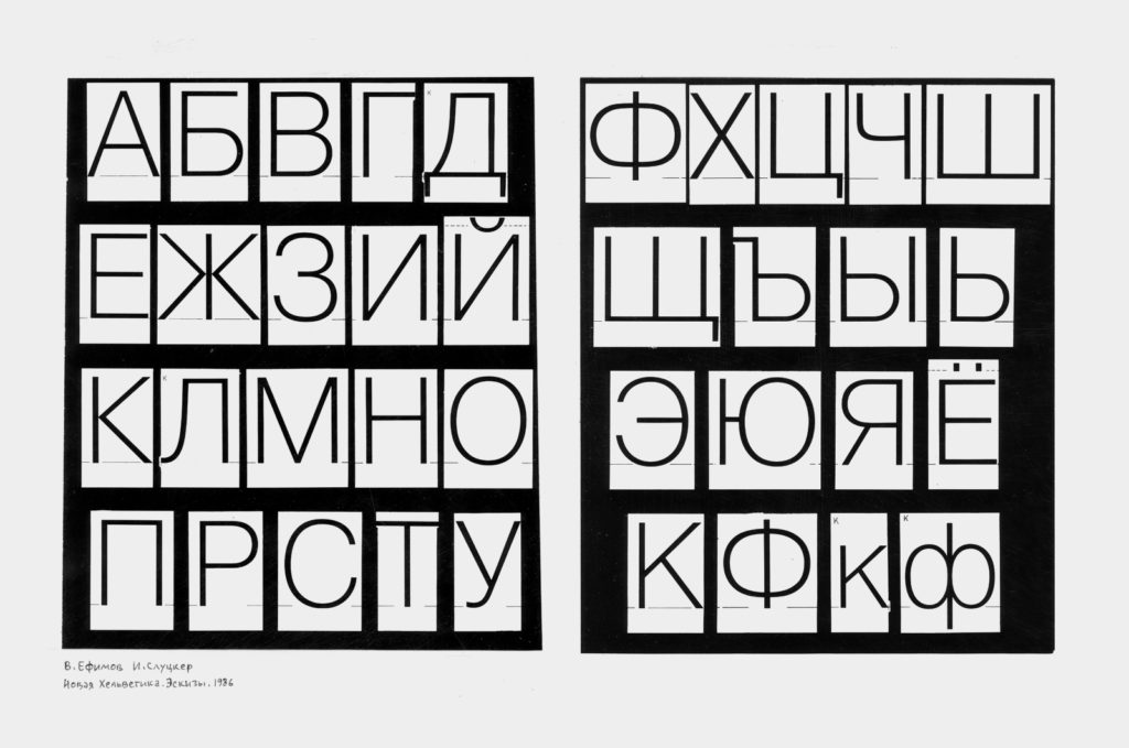

The face by Yefimov was planned as a large system with computer interpolation for the versions at the extremes of the range. The client was given five versions, all under the general title, Encyclopedia-4. The distinguishing feature of the versions was the wide space between letters set in 7-8 points. The letters of the Latin alphabet were done by Isai Solomonovich Slutsker on the basis of the Latin forms in the Letraset catalogue (he also did the Greek letters as well as the notes and the mathematical, linguistic, astronomical and other signs), which were later reworked by Vladimir Yefimov and Olga Chaeva. The further development of the face (from approximately 1989) was done at ParaType.
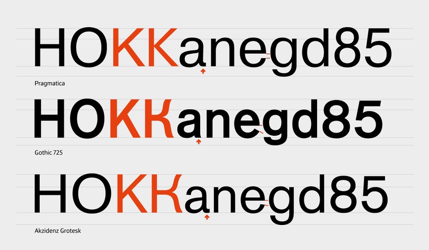
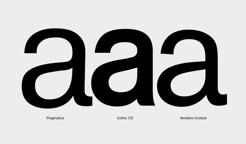
A comparison of the Latin letters of Pragmatica with the digital version of Univers reveals a range of differences – first of all, in the proportions of the letters: they are wider in Pragmatica, and all the extenders are notably longer. On the other hand, they have taken from Helvetica, unchanged, several notable forms, particularly the recognizable lowercase a and the characteristic uppercase G.
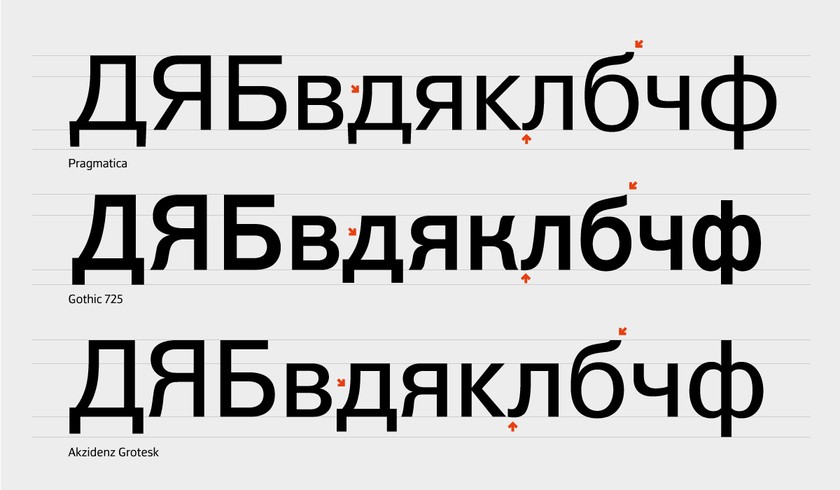
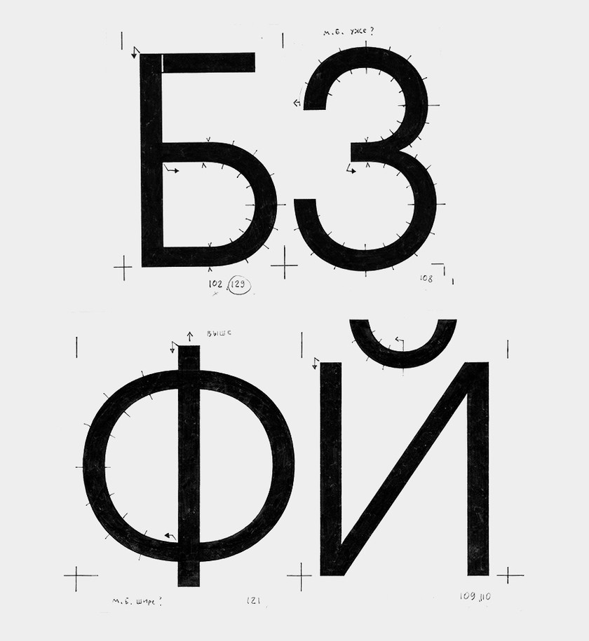
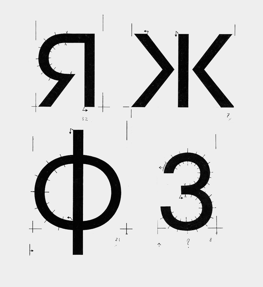
As regards the Cyrillic letters, it is worth mentioning the letter K, which has, unlike the corresponding Latin letter, the diagonals joined to the stem (as the client requested), and the single-forms Ф and Ч, which have quite high waists. In big enlargements one can detect a narrowing of the overhanging elements in the letters Д, Ц, Щ, done not for the sake of readability in extremely small point sizes but to reduce the overall weight of texts.
The special character of Pragmatic is not in its formal innovations. Yefimov did not conceive of his task as the creation of a “Cyrillic Helvetica,” which he made clear more than once. Pragmatica was, rather, his take on the then popular theme of early sans serifs. The chief dis-tinction of the typeface is the wide range of its basic styles – from extra-light to extra-bold (in all, seven; with the italic, 14). Pragmatica has developed along these same lines since 1989. Today the family comprises 42 styles (including seven narrow and seven wide, with slanted forms). The narrow styles were developed in the years 1993-2004 (by Vladimir Yefimov, Aleksandr Tar-beev, Manvel Shmavonyan, with the participation of Dmitry Kirsanov), the wide styles – in 2004 (by design-ers Olga Chaeva, Manvel Shmavonyan). In addition, the family includes three styles for setting in Armenian (Pragmatica Armyanskaya, by designer Gayane Bagda-saryan, 1997), 12 styles for setting in modern Greek and 4 styles with classical Greek letters (Pragmatica Novogogrecheskaya and Pragmatica Drevnegrecheskaya, by Vladimir Yefimov, 1989). In 2011 ParaType published one more style – Pragmatica Bruskovaya – on the basis of sketches done by Yefimov in 1988 (by designer Olga Umpeleva).
Pragmatica as a name for the family came to Vladimir Yefimov only after much searching: the name had to be, first of all, similar to “Helvetica” in length and sound, he reasoned; second, it had to read as well in Russian as in English, and, finally, the name had to reflect the chilly restraint of Helvetica. The word “Praktika,” suggested by Maksim Zhukov, soon became, happily, “Pragmatica,” which semantically is a perfect fit for the spirit of the family and, whether written in Latin or Cyrillic letters, is about the same length.
Difficulties of Translation
One of ParaGraf’s first successful steps toward the world market was its 1992 contract with the famed American company ITC (International Typeface Corporation) for the production of Cyrillic types for ITC fonts. ParaGraf’s work was led by Andrei Skaldin, Aleksei Dobrokhotov and Emil Yakupov. Maksim Zhukov played a very important role throughout. He was then ITC’s consultant for non-Latin scripts. ITC itself was then led by Alan Haley and Eileen Strizver, and it was they who turned to Zhukov with a proposal to oversee the project and act as design consultant for both sides.
The sales presentation to ITC’s Type Review Board by its future Russian partner included not just Cyrillic let-ters but also Arab, Devanagari and Greek letters and a full Hebrew alphabet. This made sense, in that multi-language type families were one of ParaGraf’s special strengths, and virtually all its leading designers (Liubov Kuznetsova, Vladimir Yefimov, Aleksandr Tarbeev, Elv-ira Slysh) were products of the school of Polygraph Ma-chine-Building’s lab for special forms, where the simul-taneous production of scripts for different writing sys-tems was a daily task. Nevertheless, the ITC Cyrillic program was a challenge for Vladimir Yefimov and his colleagues – for many technological and historical rea-sons.

The translation of Latin typefaces into other languages is often thought of as far less complex – and less creatively demanding – than developing original faces. But such translations – especially translations into Cyrillic – are no less and often more demanding, calling for a profound understanding of a task that remain inadequately conceptualized and studied.
The primarily Cyrillic faces created after Tsar Peter I’s major language reform of 1708-1710 were raw. There had obviously not been the historical evolution needed for the natural growth and nuanced shaping of the letters, which left them a world away from the situation with the graphics of the Latin alphabet, which had by then already traversed a long, step-by-step path and distinct historic periods. Western typographers of the 20th century well understood what had preceded them and had clear ideas about the many-branched historical family tree of which they were a part. This helped both in the reconstruction of classical faces and in the choice of proportions, overall look and details in new fonts. But the system was difficult to apply in the cyrillicizing of Latin typefaces, whose stylistics were formed long before Peter’s 18th century. For Cyrillic faces, the 18th century was a first stage in a European tradition already centuries old.
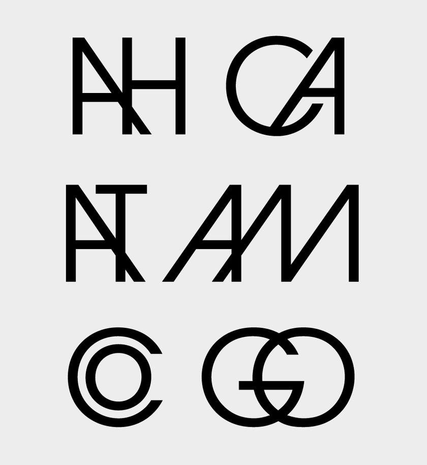
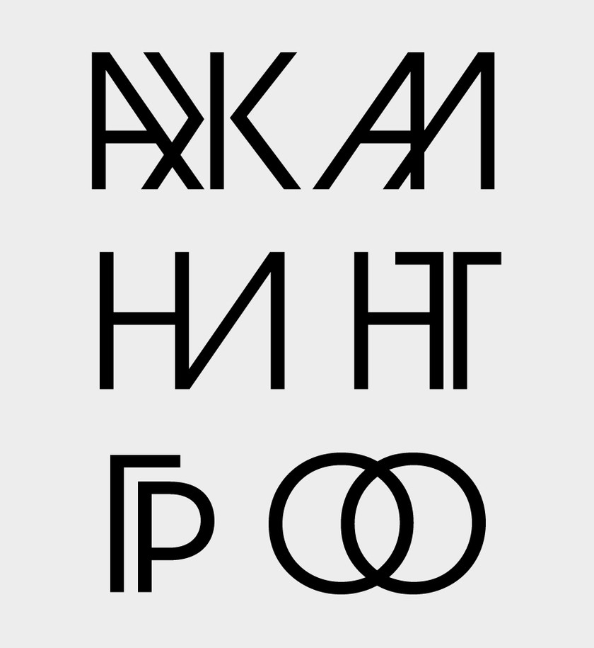
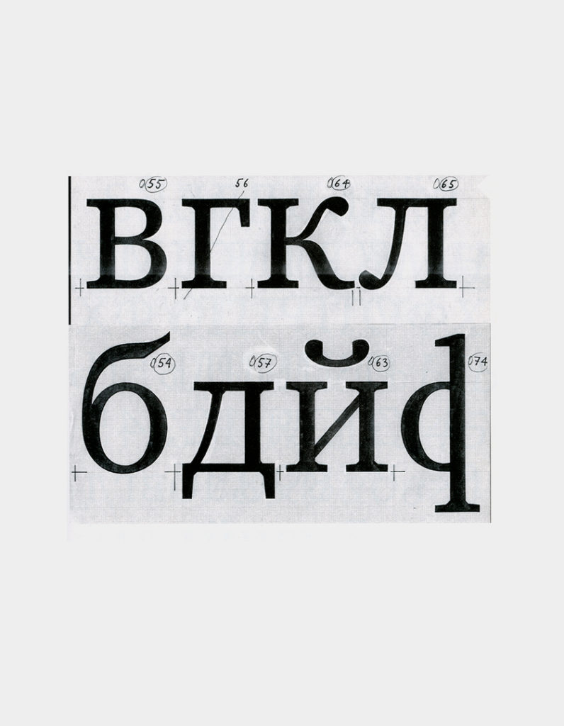
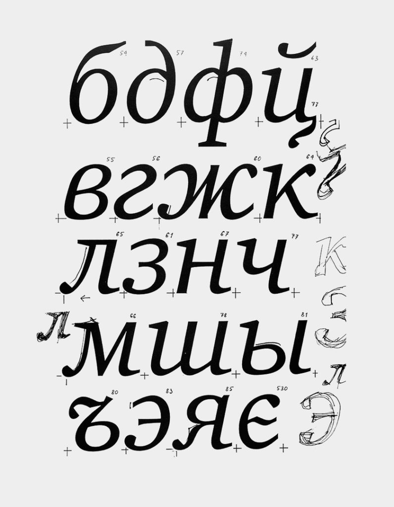
What is there to go by, for example, in designing Cyrillic faces in the style of one or another early Humanist serif? In such cases we begin, of course, with the Latin letters that graphically coincide with the Cyrillic, but this only slightly eases the task of devising exact and historically appropriate forms for readable Cyrillic letters. A historical font is being reconstructed, but without the history, as it were. The designer of a Cyrillic version of a historic type must not only capture and convey the image of the Latin original but also must determine the optimal structure for the Cyrillic letters (especially for these crucial letters: Д, д, Ж, ж, К, к, Л, л, б).
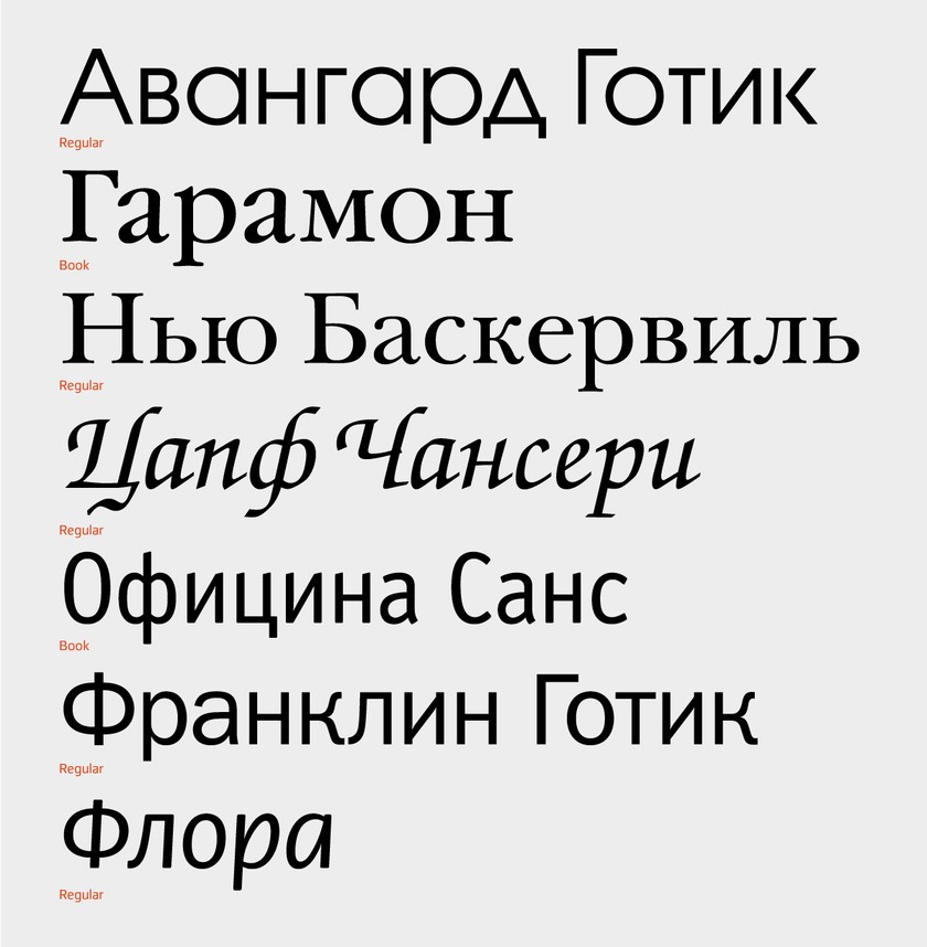
In the course of a few years, until 1997, the ITC Cyrillics’ program published four batches of faces (each having 25 features and more than 100 styles). These included ITC Avant-Garde Gothic, by Herb Lyubalin and Tom Karnezi (a popular geometric sans serif in the 1970s with many, many ligatures), ITC Garamond (an interpretation by designer Tony Sten of Jan Zhenon’s serif from 1621; 1975-1977), ITC New Baskerville, ITC Tsapf Chancery, by Herman Tsapf (1979), ITC Ofitsina Sans and Serif, by Er-ic Shpikerman (wonderfully understood and Cyrillicized by Tagir Safaev), ITC Franklin Gothic and Gerard Un-ger’s ITC Flora, still much underappreciated, and others.
Searching for Harmony
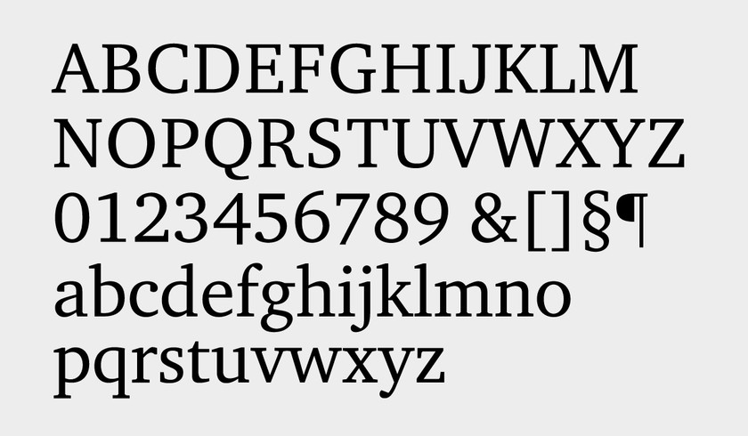
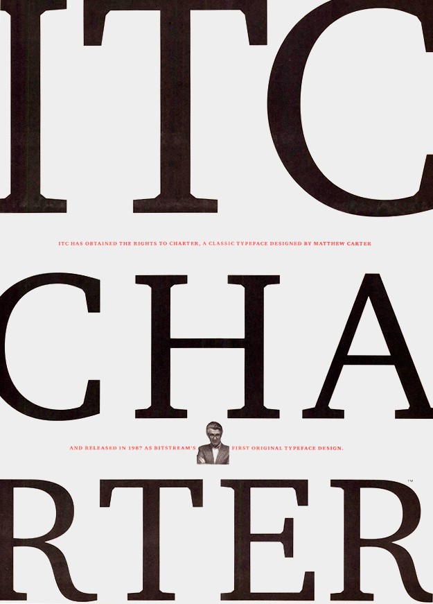
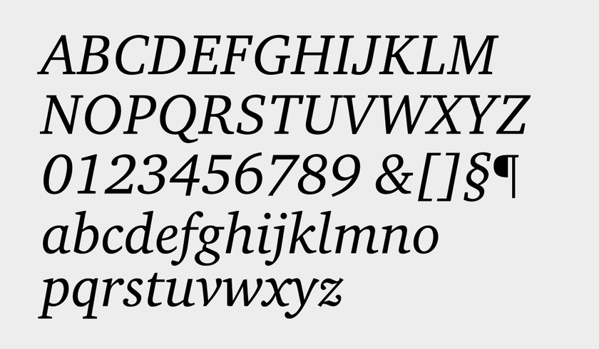
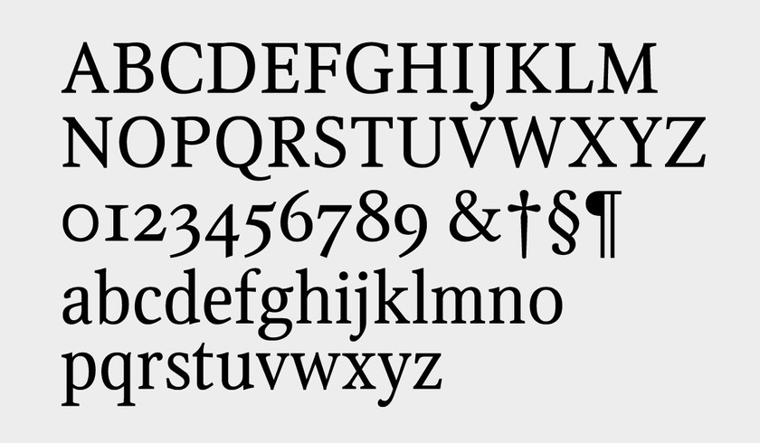
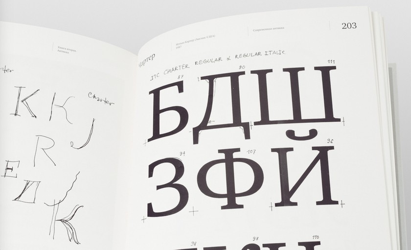
In 1999, simultaneously with the end of the arrangement with ITC, Vladimir Yefimov completed the cyrillicization of a Latin type that quickly came to fill the need for a universal, clear font useable for books and journals. This was ITC Charter, by Matthew Carter, and its popularity in the first decade of the 2000s was extraordinary: Charter was used for contemporary belles-lettres, academic research, newspapers and for exhibitions.
In formal terms, Charter is a typeface based on motifs of the transitional serifs of the mid-18th century, specifically, the typefaces of Pierre-Simon Fournier, created in Paris in the 1840s. European typography by then had become more rational and more consistent than it had been during the eras of the Renaissance and Baroque. The structures were better thought out and more mechanized, in some degree in response to the nature of metal engraving. The changes can be seen in the proportions of letters (uppercase letters gradually coming to agree in width, lowercase letters becoming narrower and more compact), and on the level of detail: the contrast between thick and thin strokes was reduced, serifs became simpler (and rounding at the point of contact with the stem fell away), the axes of the ovals began to reach toward verticality. The rationalistic principle found even greater expression in the italics, the slants of which are far more consistent than in the dynamic, variously slanted italics of Garamond and Granjon.
The structural wonder of Charter is that, despite its use of some of the usual devices of transitional serifs, it altogether avoids the traditionalism of such faces as Monotype Fournier (1924), which was based on two Fournier faces. At the level of detail, Charter is absolutely a work of the digital era, in which rationality and engineering considerations prevail in the openness of the apertures of letters, the large faces of the lowercase letters, the notably small contrast, the unique forms of the teardrop elements and the wedge-shaped swashes. In small point sizes, as in most of Carter’s text faces, Charter has a modest and modern look and reads well.
But the look of the face changes radically in large point sizes. Suddenly, we notice the teardrops, roughly cut on one side, and the powerful slab swashes directly connected to the basic strokes, a ploy that Carter introduced because of the limited curving in digital faces. Charter now presents itself as a brilliant, attention-commanding display type. The change in size lays bare the artistry of the face. Our perception of the letters is heightened, but we are not put off.
“…I have been working on making corrections in Charter, which has been insanely difficult this time. …I have lost count of the number of times I have redone the letters Ж and К,” Vladimir Yefimov wrote in June 1997 to Maksim Zhukov. “The situation has been so punishing that I have resorted at times to something like mere speculation. Insofar as in the uppercase Latin part of Charter there are, as a class, no teardrops, I wondered if I should not avoid them in the Russian part. For exam-ple, the teardrop in the lower part of the letter У was replaced with a vertical serif. And just then I thought of Academic and used, instead of a teardrop in the letters Ж, К and Л, something like the battleaxes of the Vi-kings or the skate-shaped roofs of peasant dwellings in the Russian north.”
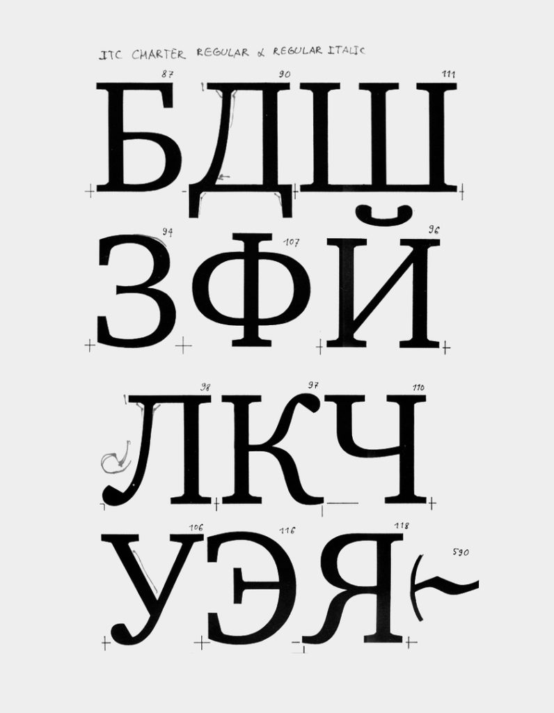
The sketches of the Cyrillic version of Charter include variants of the letters Ж, К, Л with “battleaxes”, as well as the letters Ж, К, Я with intricate lower branching, an idea suggested by the Latin R and its slightly bent leg. But how very un-Charterlike in spirit was the Cyrillic version merely in these letterforms! In the end, at the suggestion of Maksim Zhukov (who provided detailed corrections and notes on the typeface throughout its development), a variant was created with more severe diagonals, and the characteristic teardrop elements, cut within the letters, returned in the branching.
“The working out of Cyrillic italic in a serif face was al-so no easy task,” Yefimov wrote in an essay about ITC Charter. “After several attempts, we chose an almost calligraphic form of lowercase д, a zigzag form of ж and ф in the style of the italic Latin f, as well as lower-case з, л, м, э, я with teardrops in the bases. But, con-sidering the difficulties with the choice of the correct form of regular-style Ж, the drawing of the italic al-ready does not seem so frightening.”
The final version of the face consists of six styles – regu-lar, bold and extra-bold with italic counterparts. The regular and bold styles have small-cap variants, and all the styles include minuscule numbers as well as ordi-nary numbers. While the great fashion for ITC Charter has passed, it remains in the arsenal of every profes-sional typographer as a reliable tool, and it has not lost its importance as a universal serif text type with a unique array of Cyrillic symbols, over which Mathew Carter himself enthused (“probably as a courtesy,” Vla-dimir Yefimov would always add).
Original Typefaces
The Canadian poet and typographer Robert Bringhurst, in his book, The Elements of Typographic Style, has written: “<…> the typographer who has something to say strives for his own sort of magnificent inconspicuousness. The other traditional goal – durability: not an immunity against changes but a clear superiority to fashion. Typography in its finest examples is a visible form of language linking timelessness and time.”
Often, the “magnificent inconspicuousness” is a result of nothing more than the technical assignment laid on the designer. Historically, the finest examples of typography have been conditioned by the very strict limits set by the commission-giver, and the “visible form of language” conditioned by the existing printing technology, the limited possibilities of which compel the typographer to consider the forms of letters through most unlikely lenses.
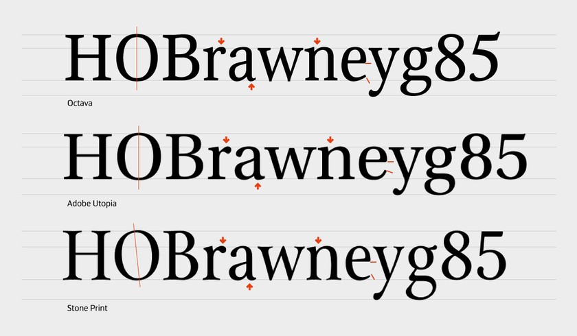
Among the typefaces developed solely by Vladimir Yefimov, it is important to single out Scriptura Rossika (1996), done to an order from the Bible Society of Russia for the printing of a Russian Bible. A commercial version of the typeface (modified and supplemented), Octava, was issued by ParaType in 2001 and remains popular.
Octava is an “invisible” typeface in a style close to a transitional serif (although it was, from the first, conceived as Old Style). Its novelty and elegance do not call attention to themselves, as it successfully does its job of being effective in small point sizes (no greater than 8-point, hence the name Octava) in voluminous texts meant for close reading. A phrase in the technical description of the task (an appendix to the contract with the Bible Society, now in the Yefimov archive) says much: “In view of the use of the typeface, it should not evoke associations with any particular historical period and should be quite neutral and, at the same time, sug-gest significance and gravity.”
The relationship of uppercase to lowercase letters (which are extremely narrow) in Octava is approximately 7/5, the above-line and below-line extenders are of average length, and the degree of variation in width among the letters is small. Contrast is, by no means, strong, the axes of the ovals are largely vertical, and there is virtually no overall angle of stroke inclination. As a result, the rhythm of lines in Octava is quiet, but, interestingly, the overall image of the face is very contemporary (for good reason, such unchurchly publications as Bolshoi Gorod (Big City) and Smart Money were, for a time, set in Octava).
As Vladimir Yefimov said, Octava had two close prototypes – Lektura (1969), by the Dutch designer Dijck Doois, and Stone Print (1993), by Sumner Stone. Interestingly, both prototypes (they certainly are similar to Octava in drawing and proportions) were designed either with an eye on specific technologies or on contract specifications. Thus, Doois began the design of Lektura in 1964 as a book text type for photo-composition on the basis of motifs in the faces created by the Dutch punchcutter Christoffel van Dijck (1601-1669). The technology of photo composition was being developed at that time by the English firm Intertype, famed for its Linotype machines. Sumner Stone, in his turn, sought maximum volume and economy in his typeface, as these were conditions set by the client, the journal Print.
The history of typography is full of outstanding typefaces designed for printing the Bible (beginning with Gutenberg). In the 1950s, Harry Carter designed a version of Times New Roman for the Bible printed by Oxford University Press; also widely known is ITC Weidemann (1983, designed by Kurt Weidemann; its first incarnation, in 1979, was called Biblika), which was chosen for setting the German Bible published through the efforts of the Protestant and Catholic churches of Germany. Of more recent typefaces, there are Kollis (1993), originally designed for a series of book covers and later expanded into a type family for the Swiss publishing house Theologischer Verlag Zurich, as well as the type family Karmina (2015), designed by Jose Skaglione and Veronika Burian with the assistance of Alexandra Korolkova.
The final version of Octava, issued by ParaType in 2001, includes four styles (regular, italic, bold and bold italic). Regular has been supplemented with small caps and mi-nuscule numbers.
Legacy
Vladimir Yefimov created more than 60 fonts (in all, more than 200 styles) during his time with ParaGraf and ParaType. In stylistic terms, Yefimov’s range was wide from the first. In addition to the typefaces already mentioned, these other Cyrillic typefaces by Yefimov are known to every designer: Newton (1990), Didona (1992), Kish (1999), Adver Gothic (1989), Peterburg (1992), Futura (1995, 1997), Mason Sans and Mason Serif (2002), Stone Sans (2011) and Stone Serif (2012). Vladimir Yefimov did consulting for a great many designers, and consulting was his principal occupation at times.
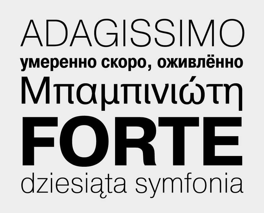
Moreover, Yefimov typefaces continue to be produced. Tthe ParaType library in early 2015 added a type system consisting of Yefimovskaya Serif and Yefimovskaya Sans, one of the last original typefaces from the master. It was completed after his death by Alexandra Korolovska and Maria Selezeneva. Each face consists of fonts in four weights with italics. All the fonts in the family agree in size, weight, proportions and aptness for contemporary work.
The Yefimov Serif is transitional, with open forms and narrowed letters. Its lowercase has a large oval, compact extenders and little contrast between thick and thin lines. The drawing is very economical in the means used, but expressive. The key feature of the letters is their erectness. Curves are used only when they form a large element, in ovals and final elements. The asymmetric slab swashes that touch the stems may remind us of Charter, but careful inspection reveals a simple triangle rather than rounding at the point of contact.
The Yefimovsky Sans is, like the antique, also universal, being comfortably readable in both small and display sizes. Dynamic, open and Humanistic, with the same characteristically “square” proportions as its fellow, it has a number of special touches: the slanted cuts in the basic strokes, the unusual forms of lowercase е, м and ф.
Author, Editor, Translator
Vladimir Yefimov sometimes quoted the word, “Eeya” from A. A. Milne’s tale of Winnie-the-Pooh in the trans-lation by Boris Zakhoder:
“Listen to me, little Dot. In this Forest, all sorts of people jostle about, and they all say: ‘Well, Eeya’ – just Eeya, which means nothing. They stroll about, here and there, and say: ‘Ha-ha!’ But what do they know about the letter ‘A’? Nothing. For them it’s just three sticks. But for educated people – take note, little Dot, I am not speaking of Pooh and Dots – for educated people, it is the famous and powerful letter ‘A’.”
Yefimov’s writing about types always has this personal quality, and his words served as personal inspiration for many people. His innumerable journal articles, reports, introductions and notes to translations and, later, his own books are all written in the same unmistakable style. He was scholarly but never boring, expertly mix-ing dry facts and analysis with asides of amusing stories. He constantly reinforced the reader’s sense that the world is full of beautiful things, and that the alphabet, a prosaic thing at first glance, is full of this beauty.
In the 1990s he published articles in the journals Da!, Polygraphy, Kursiv, [kAk), Pablish and others. In them Yefimov discusses the history of Russian writing, touches on questions of micro-typography, regularly comments on all significant professional exhibitions and typeface competitions and writes a series of reports on designing Cyrillic versions of Latin faces. Few people at that time knew much about the art of writing and typography, but personal computers were already becoming regular household items, and they made it possible for newcomers to draw typefaces, set books and generally work at graphic design. At no point did Vladimir Yefimov say a word against what had come into the hands of ordinary users in the digital age; rather, he patiently and sensibly shared his knowledge and experience.
The number of new books about design was steadily rising, but their quality left much to be desired. Contradictory typographic terminology, misunderstandings in the transcription of the names of designers and the names of typefaces, unreliable dating – all demanded editing, greater specification and, most often, footnoted comments. Thus, the outstanding book by the scholar-technologist Peter Karov, published by Mir in 2001 in a translation by O. Karpinsky and I. Kulikova, has the benefit not only of an introduction by Vladimir Yefimov but also a detailed essay by him on the development of Cyrillic type. Although the volume was not very well designed (this kind of paradox continues to this day for typographical literature), the book, thanks to its valuable contents and careful editing, remains a good source of information on the history of the development of dig-ital technology in the area of type design.
A watershed moment for Russian typography came in 2006 with the publication of a Russian translation of Canadian typographer Robert Bringhurst’s The Elements of Typographic Style. Its Russian publisher, Dmitry Aronov, faced a difficult task: on the one hand, there was a need to convey the style of an original text rich in metaphors and poetic flights, and, on the other, to preserve the design and typographic look given by the author himself. On both counts, the role of Vladimir Yefimov was central. In addition, it was necessary to put the text in the context of Russian realities. In his footnotes, Yefimov goes beyond Karov to include terms and rules for many typographic situations faced specifically in Russia.
The history of the design and printing of the Russian edition of Bringhurst’s bestseller might well deserve its own book. In the words of Dmitry Aronov, a condition of Vladimir Yefimov’s participation in the project was a change in the typeface. Bringhurst’s use of a Cyrillic version of Minion (in the original edition) would have signified, Yefimov thought, approval of a bad typeface. The choice, instead, went to Charter, but that led to another problem – how to combine a transitional serif (Charter) and the typeface for the marginalia, the Humanist sans serif, Humanist 531, by designer Hans Eduard Maier (his Syntax was used by Bringhurst in the first American editions). As Dmitry Aronov observed, the combination was made to work by a careful adjusting of sizes, tracking and oth-er microtypographic magic. In addition, both the serif and sans serif had to be provided with minuscule num-bers and small caps. Finally, Vladimir Yefimov added to ITC Charter, especially for this edition, Greek letters, ligatures and additional Cyrillic letters, and added Cyrillic small caps, minuscule numbers and a slanted style (in collaboration with Manvel Shmavonyan) to Humanist 531.
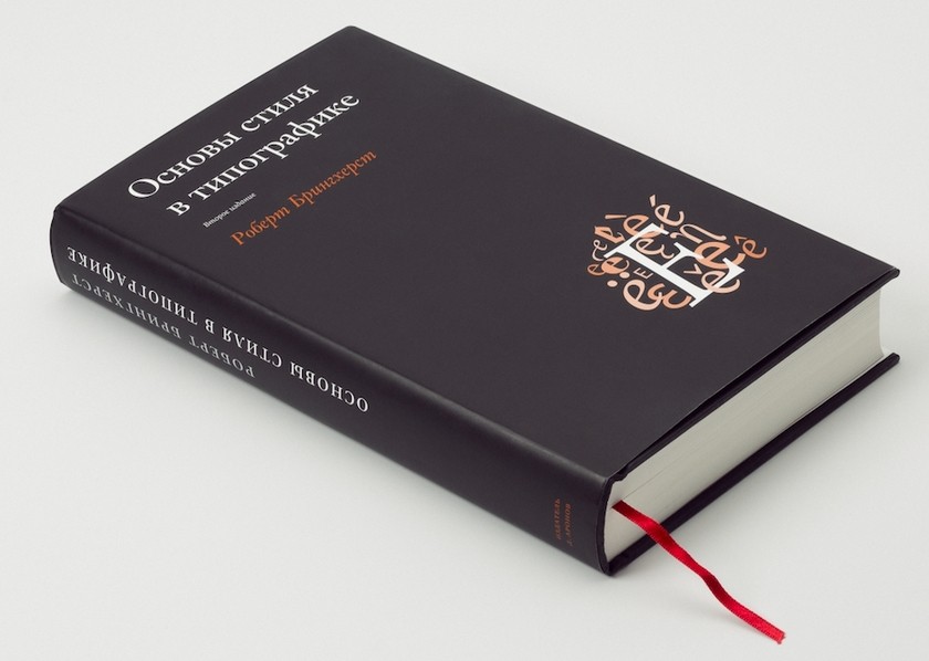
Publication of Bringhurst’s book in Russia was a genuine event: here was a “bible of typography,” a book about greatness of typographic style and its criteria. Philosophical considerations combine in it with practical tips about microtypography, proofs and book design, chapters on the choice and coordination of typefaces (not only Latin) and on how to work with non-alphabetical symbols. Among other things, Bringhurst devotes considerable space to the classification of typefaces and evolution of type forms. In 2013 Dmitry Aronov published a second edition with one new chapter and additional material scattered throughout. For the second edition in Russian, Vladimir Yefimov translated a large part of the new texts.
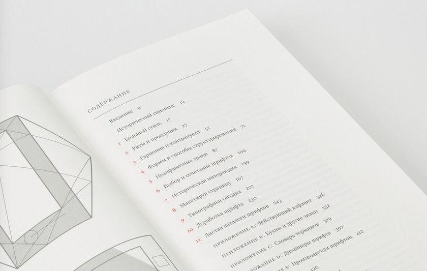
Great Typefaces
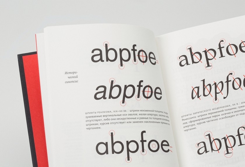
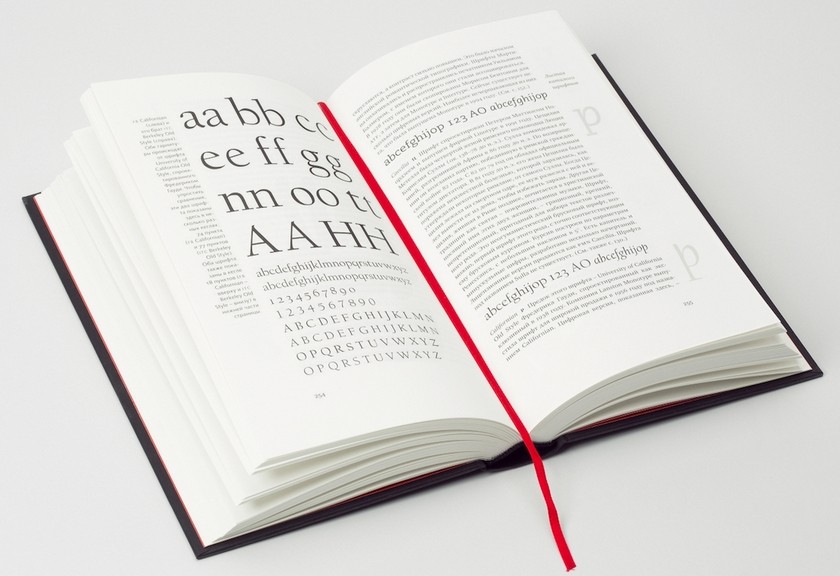
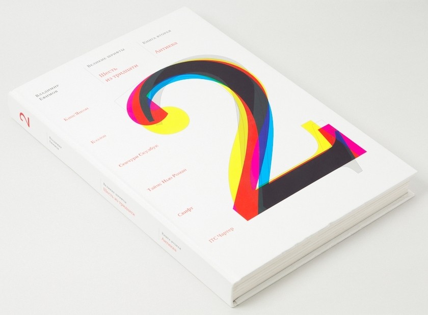
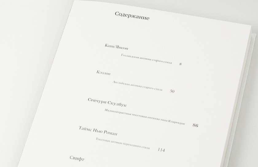
The Great Typefaces series (of which, unfortunately, we have only two volumes of a planned five) was dedicated to significant text typefaces. In the first volume (Sources, 2006), the classic types are described: Gara-mond, Baskerville, Bodoni, Accidenz-Grotesk, Futura and Rockwell. The second volume (Antikva, 2007) reviews the great serifs: Kish/Janson, Caslon, Century Schoolbook, Times New Roman, Swift, ITC Charter. Both volumes were written with Anna Shmelova.
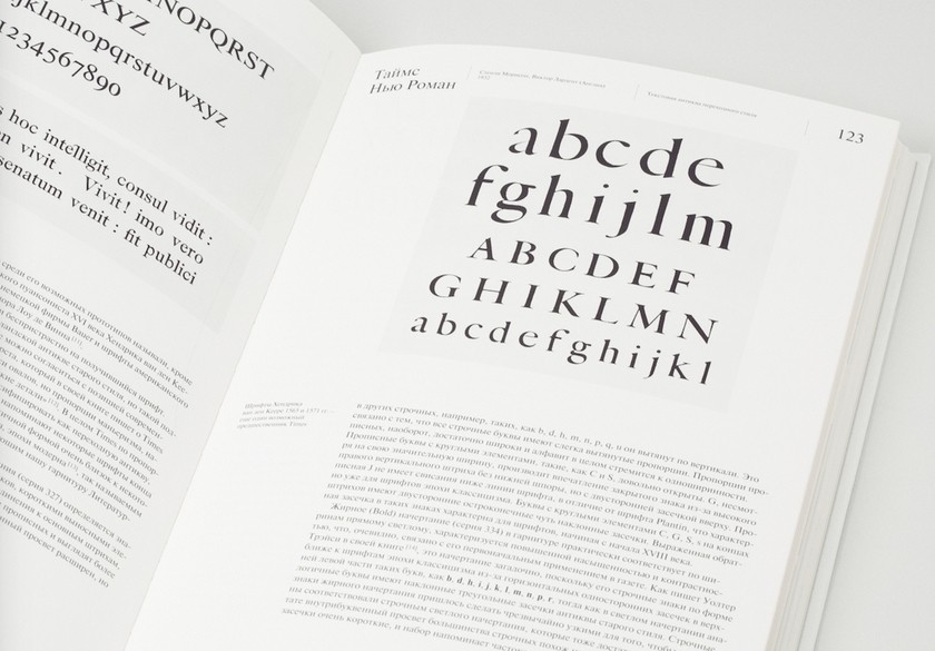
Using the chapter in the second volume on Gerard Un-ger and his typeface Swift, we can trace the narrative principles used by Vladimir Yefimov throughout the book. One of the chief aspects of type design in every era is the existing technology for setting type and printing, and Yefimov always analyzes that. With Unger, he focuses on the connection of offset printing to Unger’s new ideas. For Yefimov, typefaces are, first of all, works of art arising at the juncture of technology, science and the creative personality of the designer. As a result, he is very careful in writing about designers, digging deep in the archives for facts and loath to accept even widely believed stories. Moreover, Yefimov knew and exchanged letters with many of his principal subjects (Carter, Unger) and was able to ask for unique archival materials to help the reader better imagine the designer’s way of working on one or another project.
After the details of the life, the narrative turns to the careful, detailed analysis of the typeface. Each essay compares the typeface under analysis with similar faces. Like his type designs, Vladimir Yefimov prose has a rare elegance; it is laconic, exact and almost devoid of judgments forced upon the reader. Judging the typefaces is left to the reader, but the entire historical and factual context for so doing is provided by the author.
The third volume of the series, “Great Types,” was to have been devoted to sans serif designs, and the fourth to “the legacy” – that is, to Russian typefaces from before the revolution and from the Soviet period; the fifth volume to superassemblages. These plans have not been forgotten: work on the third volume is now underway at ParaType, and there is hope that we will soon have definite publication plans.
Master of All Things Type
Vadim Lazursky, the designer of books and typefaces, compared type to music in the final chapter of his memoir: “There is no art among the spatial arts so close to music as typography.”
Music is unimaginable without rhythm and movement, nor is typography. Yet text type is a very conservative medium. How, then, to create a truly original typeface that will not simply be briefly modish but can take its place in the history of typography and, most important, truly serve its people, culture and nation? The answer, no doubt, will never be found, for that would mean that the secrets of the art had all been revealed. Still, every designer seeks the answer.
The creative journey of Vladimir Yefimov was all too brief, but his drawings and writings are enough to convince us of one simple truth: his fate was type and typography. He is remembered today, as man and artist, by relatives, friends, colleagues and students. And there will always be the alphabetic letters that he fashioned, which are to be seen in thousands of books, newspapers and journals, lying on shelves, visible on websites and streets. We peruse them and are moved, subconsciously, to live to the rhythm of those letters without which our civilization could not exist.
I am grateful to Dmitry Aronov, Sergei Bobryshev, Aleksei Dombrovsky, Yevgeny Grigoriev, Maksim Zhukov, Dmitry Kirsanov, Gennady Fridman and Yevgeny Yukechev for valuable comments and help in the preparation of the text.
Dates in the life
and work of Vladimir Yefimov
Born in Moscow, May 6, 1949
1962–1968
Study at Moscow Middle Art School (MCXIII).
1968–1973
Moscow Polygraphic Institute.
August 1973-November 1973
Artist in the typeface department of Polygraph Machine-Building, Moscow.
1973–1974
Service in Soviet army.
1975–1991
Senior artist, artist-constructor 1st class, lead construc-tor at Polygraph Machine-Building.
1992–1998
Artist at ParaGraf International, Moscow.
1998–2012
Art director of ParaType.
Basic typefaces by Vladimir Yefimov
- Hindi-Cascad (2 styles for printing in Hindi and Mara-thi, 1980).
- Bengali-Cascad (2 styles for printing in Bengali, 1981).
- Hindi-Grotesk (2 styles for printing in Hindi and Marath, 1982).
- Devanagari-Cascad (2 styles for printing in Hindi, Mara-thi and Nevarsky)
- Lazursky (adapted for photosetting of two color styles and two supplementary semi-bold styles, 1984).
- Encyclopedia-4 (five Latin-Cyrillic styles, 4 Greek styles, 2 calligraphic styles, fractura, glagolitica, linguistic, mathematical, astronomical, footnote letters, done in collaboration with Isai Skutsker, 1985-1989).
- Pragmatica (6 styles, 1989-1994). Plus 8 supplementary styles, done in collaboration with Isabella Chaeva, 2004. Plus 12 narrow styles, done in collaboration with Man-vel Shmavonyan, 2003. Plus 14 wide styles, done in col-laboration with Isabella Chaeva and Manvel Shmavon-yan, 2003-2004.
- EdverGothic (1 bold style, 1989).
- Newton (formerly TimesET, 5 styles, 1990, done in col-laboration with Aleksandr Tarbeev).
- Kompakt (4 styles, 1991).
- Ordinary bold (digital version, 1 style, 1991).
- Futura Futuris (b. Futuris, 6 styles, 1991-1995, 2 narrow and 4 decorative styles, done in collaboration with Aleksandr Tarbeev).
- Peterburg (4 styles, 1992).
- Didona (1 style, 1992).
- ITC Avant Garde Gothic (Cyrillic version, 4 styles, 1993).
- ITC Fat Face (Cyrillic version, 1 style, 1993 – in collabo-ration with Gennady Barylshnikov.
- ITC Chancery (Cyrillic version, 1 style, 1993 – in collab-oration with Gennady Baryshnikov).
- Gerold (digital version, 2 sthyles, 1994).
- ITC Machine (Cyrillic version, 2 styles, 1994 – in collab-oration with Gennady Baryshnikov).
- Neufville Futura (Cyrillic version, 8 styles, 1994). Plus 6 bold and 8 narrow styles done by Isabella Chaeva, 2004-2005.
- Artur (Cyrillic version, 1 style, 1994). On basis of Mari-gold.
- Pragmatica Greek (4 styles, 1994).
- Newton Greek (4 styles, 1995).
- Flora (Cyrillic version, 2 styles, 1995 – in collaboration with Emma Zakharova).
- ITC True Grit (Cyrillic version, 1 style, 1996).
- Oktava (4 styles plus small caps, 1996-2000).
- New Usual (digital version, 4 styles, 1997).
- Pragmatica Georgian (1 style, 1999).
- Newton Georgian (2 styles, 1999).
- FontFont Thesis Sans (Cyrillic version, 4 styles, com-missioned, 1999).
- ITC Charter (Cyrillic version, 6 styles plus 2 small caps, 1999).
- English 157 (Cyrillic version, 1 style, 1999).
- Kis (Cyrillic version, 2 styles plus small caps, 1999-2002).
- Raleigh (Cyrillic version, 6 styles, 2000).
- Courier Coptic (1 style, on commission, 2001).
- Salon-Garamond (1 style, on commission, 2001).
- Émigré Mason Serif (Cyrillic version, 2 styles, 2001).
- ITC Benguiat (Cyrillic version, 6 styles, 2002).
- ITC Stone Sans (Cyrillic version, 4 styles, 2002).
- Denda New (Cyrillic version, 4 styles, on commission, 2002).
- Émigré Mason Sans (Cyrillic version, 2 styles, 2002).
- Newton Phonetic (bold style, on commission, 2002).
- Caflisch Script (Cyrillic version, 1 style, on commission, 2003).
- Yevreiskaya [Hebrew] (2 styles, 2003-2004).
- Pallada (2 supplementary regular styles and 6 small cap versions – color, color cursive, regular, regular cursive, bold, bold cursive, on commission, 2003).
- Pragmatica Phonetic (regular style, on commission, 2003).
- Zapf Calligraphic 801 (Palatino, Cyrillic version, 4 styles plus small caps and a display cursive with flourishes, 2004), not completed.
- Helvetica Neue Greek Medium & Black (modern Greek version, 2 styles, on commission, 2004).
- Mysl [Idea] (revision of the digital version, 4 styles, plus a reworking of small caps, 2004), not completed.
- Amplitude Bold (Cyrillic version, 1 style, on commis-sion, 2004).
- Goethe Text (revision of the Cyrillic, 4 styles, on com-mission, 2005).
- Today (Cyrillic version, 2 styles, plus 2 small caps, on commission, 2005).
- ITC Stone Serif (Cyrillic version, 4 styles, plus small caps, 2005).
- Akzidenz Grotesk (revision of the Cyrillic. Light, medi-um, regular, bold, light extended, medium extended, 2005, Cyrillic version, 6 styles, 2006).
- Monotype Baskerville (small caps, Cyrillic version, on commission, 2006).
- Imago (Cyrillic version, 4 styles, 2005; 8 styles, plus 12 small caps, 2006-2007).
- ITC Zapf Chancery (alternative version, 1 style, 2007).
- EnglishZV (cursive version on commission from compa-ny Zolotoe Vremya, 1 style 2007).
- Neutraliser (Cyrillic version, 2 styles, on commission, 2007).
- Interstate (revision of Cyrillic, 2 styles, on commission, 2007).
- Amplitude (Cyrillic version, 4 styles, on commission, 2007 – in collaboration with Oleg Karpinsky).
- Pragmatica 55, small caps (1 style, 2008).
- Humanist 521 (Gill Sans, Cyrillic version, 4 styles, 2008).
- LT Zapfino One (Cyrillic version, 1 style, on commission, 2008).
- Troika Sans (conception and 4 styles, 2009).
- Troika Serif (conception and 4 styles, 2009).
- Kuenstler 480 (5 styles, 2007-2011, with the participa-tion of Bella Chaeva).
Major exhibitions of Vladimir Yefimov
- International exhibit, “InPolygraphmashin-83”, Moscow Expocenter (1983).
- “Typografica USSR”, New York (1985).
- Exhibition of the creative group Hermitage, Moscow, Belyaevo exhibit space (1988).
- Exhibit-competition “Shrift-89”, Moscow (1989): di-plomas for projects Jeff Futuris and Jeff GotSerif.
- “Khudozhnik I Pechat” [Artist and Printing], Moscow, TsDKh (1991).
- ParaType ot A do Ya [ParaType from A to Z], Moscow, IMA-Gallery (1995).
- International biennale of graphic design, “Zolotaya Pchela 3”, Moscow, TsDKh (1996): grand prize in category Shrift for Oktava.
- 18th Exhibition of Moscow Artists of the Book, Moscow, exhibit space at Kuznetsky Most (1998).
- Type Directors Club type design competition (New York, 2000), honorable mention “For Perfection of Typeface Design” for the Cyrillic version of Bitstream Kish.
- 20th Exhibition of Moscow Artists of the Book, Moscow, exhibition space at Kuznetsky Most (2003).
- “Dyr Bul Shchyl. Typeface: architectonics. New faces in the ParaType library”, Moscow, MYAP (2003).
- First international exhibit-competition, “Shrift 2005”, St. Petersburg, TsDX (2005).
- “Design and Advertising-2005”, Project “Typography and the Architecture of Moscow”, Moscow, TsDX (2005).
- “Obraz knigi” [the look of a book]. Exhibit of contemporary book design. Moscow, Exhibit space at Kuznetsky Most (2005).
- “Artist and Book 007”, Moscow Artists’ Union. Association of Graphic Artists. Moscow, exhibit space at Kuznetsky Most (2007).
- International biennale of graphic design, “Zolotaya Pchela 8”, Moscow, TsDX (2008).
- “Vladimir Yefimov. Master of Typography”, Moscow, A. V. Shchusev State Museum of Architecture, 2010.
Publications of Vladimir Yefimov
(compiled by Aleksei Dombrovsky)
- From the compilers (with co-author G. I. Kozubov) // Typefaces for photo composition: a catalogue and guide. Moscow: Kniga, 1983, pp. 3-7.
- From a compiler // Typefaces for photo composition: a catalogue and guide. No. 2. Moscow: Kniga, 1985, p. 3.
- Afterword // Shitsgal A. G., Russian printing types: questions on the history and practical applications. 2nd edition, corrected and edited. Moscow: Kniga, 1985, pp. 229-238.
- The Great Petrine Watershed: The Dramatic Story of Cyrillic // Da! A Russian journal for designers-graphic artists. Moscow, 1993, N. 0, pp. 26-30. Corrected and supplemented version: DE(-)FIS, An interactive journal about typefaces, 1997, No. 4. — part 1, part 2, part 3.
- Catalogues of types: An historical perspective // Pol-ygraphiya. Moscow, 1995, No. 3.
- How typefaces are made: A plan for a Cyrillic version of a Latin typeface // Kursiv. Moscow, 1996, No. 1.
- Cyrillic, sister of Latin: A plan for a Cyrillic version of a Latin typeface // Kursiv. Moscow, 1996, No. 2.
- Cursive and bold relatives: a plan for a Cyrillic version of a Latin typeface // Kursiv. Moscow, 1996, No. 3.
- How to place quotation marks? // DE(-)FIS, an interac-tive journal about typefaces, 1996, No. 1.
- Vadim Lazursky and his typeface // Kak, a journal about graphic design. Moscow, 1997, No. 2 (2).
- Typefaces. Development and Use (with co-authors G. M. Baryshnikov, A. Yu. Bizyaev, A. A. Moiseev, E. I. Pochtar, Yu. A. Yarmola). Moscow: Ekom. 1997.
- Destiny of ParaType: a typeface storm // Kak, a journal about graphic design. Moscow, 1998, No. 1 (3).
- About rating typefaces // Kak, a journal about graphic design. Moscow, 1998, Nos. 2-3 (4-5).
- The unusual adventures of Helvetica in Russia // Publish. Moscow, 1998, Nos. 5-6. (copy)
- Cyrillic! The word may be odd, but we feel it… Inter-view // Kak, a journal about graphic design. Moscow, 1999, No. 1 (7).
- Comments on an article by Mark Nixon, “Typeface Val-ues” // Publish. Moscow, 1999, No. 3.
- New Roman Times: Almost a detective story about a typeface // Publish. Moscow, 1999, No. 4. (copy)
- A typeface // Kniga: Encyclopedia. Moscow: Great Rus-sian Encyclopedia, 1999, p. 154.
- Grotesk // Kniga: Encyclopedia. Moscow: Great Rus-sian Encyclopedia, 1999, p. 181.
- Typeface capacity // Kniga: Encyclopedia. Moscow: Great Russian Encyclopedia, 1999, p. 208.
- Caslon // Kniga: Encyclopedia. Moscow: Great Russian Encyclopedia, 1999, p. 281.
- Kudryashev // Kniga: encyclopedia. Moscow: Great Russian Encyclopedia, 1999, pp. 351-352.
- Kuznetsova // Kniga: encyclopedia. Moscow: Great Russian Encyclopedia, 1999, p. 352.
- Cursive // Kniga: encyclopedia. Moscow: Great Russian Encyclopedia, 1999, p. 355.
- Lazursky // Kniga: encyclopedia. Moscow: Great Rus-sian Encyclopedia, 1999, pp. 359-360.
- A typeface // Kniga: encyclopedia. Moscow: Great Rus-sian Encyclopedia, 1999, pp. 440-441.
- Rovensky // Kniga: encyclopedia. Moscow: Great Rus-sian Encyclopedia, 1999, p. 531.
- Slutsker // Kniga: encyclopedia. Moscow: Great Rus-sian Encyclopedia, 1999, p. 599.
- Type // Kniga: encyclopedia. Moscow: Great Russian Encyclopedia, 1999, pp. 722-724.
- How many types are needed for happiness? (in collabo-ration with Anna Shmeleva) // Kursiv. Moscow, 2000, Nos. 5-6. (copy)
- Foreword to the Russian edition // Karov P., Typeface technologies: Description and tools. Moscow: Mir, 2001, pp. 5-10.
- Chapter 17. Cyrillic: An essay on the development of Cyrillic typefaces // Karov P., Typeface technologies: Description and tools. Moscow: Mir, 2001, pp. 341-400.
- FUTUROlogiya (in collaboration with Anna Shmeleva // Publish. Moscow, 2001, No. 4.
- Three days in Boston (and five in New York): Impres-sions of a participant (in collaboration with Anna Shmeleva) // DE(-)FIS, an international journal about typefaces, 2001, No. 7.
- ATurI 2000 (Leipzig): Impressions of a participant (in collaboration with Anna Shmeleva) // DE(-)FIS, an in-teractive journal of typefaces, 2001, No. 7.
- Civil Type and Kis Cyrillic // Language Culture Type: International type design in the age of Unicode. New York: ATypI/Graphis, 2002, pp. 128-147.
- Why I make typefaces? Mini-interview // Designer, a journal about visual communications. St. Petersburg, 2003, No. 3 (6), special edition on type design, p. 5.
- The typeface around us // Designer, a journal about vis-ual communications. St. Petersburg, 2003, No. 3 (6), a special issue on type design, pp. 45-46.
- Beware: typography! About the tortuous fates of the lit-erature on typography in Russia (in collaboration with Anna Shmeleva) // Publish. Moscow, 2004, No. 3.
- Great typefaces: Six of 30 (in collaboration with Anna Shmeleva). Book 1. Sources: Garamond, Baskerville, Bodoni, Aktsidenz-Grotesk, Futura, Rockwell. // Moscow: ParaType, 2006.
- Notes to the Russian edition // Bringhurst, P., Elements of Typographic Style. Moscow: D. Aronov, 2006, pp. 390-410.
- About the book by Robert Bringhurst, Elements of Ty-pographic Style // Kak, a journal about graphic design (electronic version).
- Commentary on a theme (afterword to Yu. Gordon’s ar-ticle, “Symbol of the ruble: an analysis”) // Prozhektor. St. Petersburg, 2007, No. 0 (1), p. 41.
- Goethe text: an experiment in adapting Cyrillic // Prozhektor. St. Petersburg, 2007, No. 0 (1), pp. 42-44.
- Great typefaces: Six of 30 (in collaboration with Anna Shmeleva). Book 2. Serif: Kish/Janson, Caslon, Century Schoolbook, Times New Roman, Swift, ITC Charter. Moscow: ParaType, 2007.
- The great Petrine watershed: Introduction of civil type from point of view of type design // Three centuries of Russian civil type (1708-2008). Materials of scholarly conference, Iniya grazhdanskiya knigi pechatat temizh novymi azbukami…” June 3, 2008.
- Moscow: Pashkov House, 2008, pp. 37-49.
- Cyrillic and Latin: interactions // Kak, a journal of world design. Moscow, 2008, No. 4 (48), pp. 30-37.
- Commentaries // Chikhold, Yan. Profile of book: Selected essays on book design and typography. Moscow: Studio of Artemii Lebedev, 2009
- “It all happened quite accidentally…” // Type-Konstruktor: Designers on typography. Moscow: Para-Type, 2010.
- The Kirchevsky print shop (in collaboration with Anna Shmeleva) // Prozhektor. St. Petersburg, 2010, No. 3 (12), pp. 104-107.
- Vladimir Yefimov. Master of all-thing-type: Catalogue of exhibition. Sept. 14-20, 2010. Moscow: ParaType, 2010.
- Fleishman and Rosari (in collaboration with Anna Shmeleva) // Prozhektor. St. Petersburg, 2011, No. 1 (14), pp. 30-37.
- Civil type and Cyrillic Kish // Electronic journal Shrift. Sept. 3, 2013.
- Civil type and Cyrillic “Kish”. Moscow: Shrift, 2013.
- Cyrillic Kish // electronic journal Shrift. Jan. 24, 2014.