
Images


Description
How it all began
It all started with sketches by Alexandra Korolkova for a custom font. For the customer, this option turned out to be too radical, but against the background of endless conservative text fonts, we were so pleased with the idea of rigid modularity combined with dope (grid and no compensation!) That we decided to make it and release it.
Alexandra has drawn the main part of the lowercase Cyrillic alphabet in regular style. Then Dmitry Goloub came to Paratype and picked up after finishing the remaining iconic composition. Then the working title was “Mobila”. Initially, Mobila planned three styles – regular, bold and bold, but the difference between them seemed insufficient to us, so by creating a bold style we got an extra-fat and light method by extrapolation.
Design details
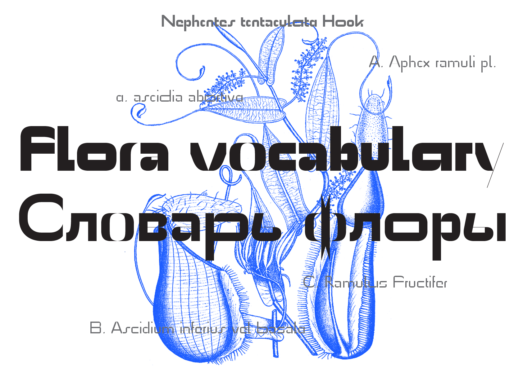
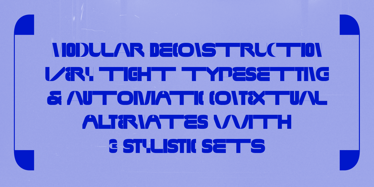
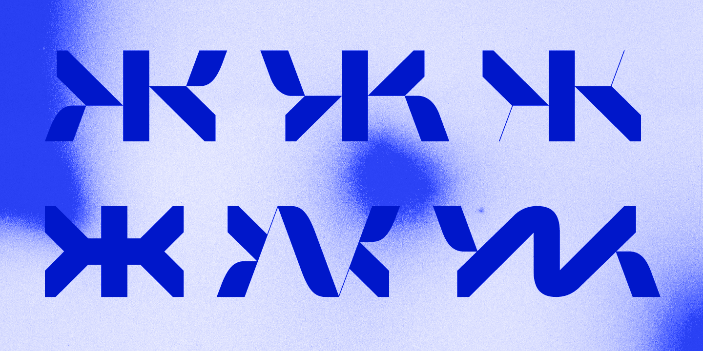
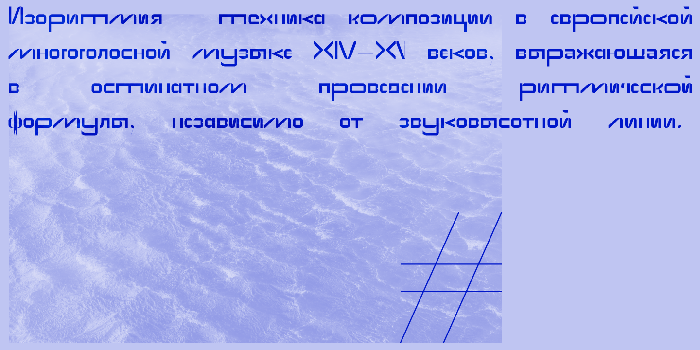
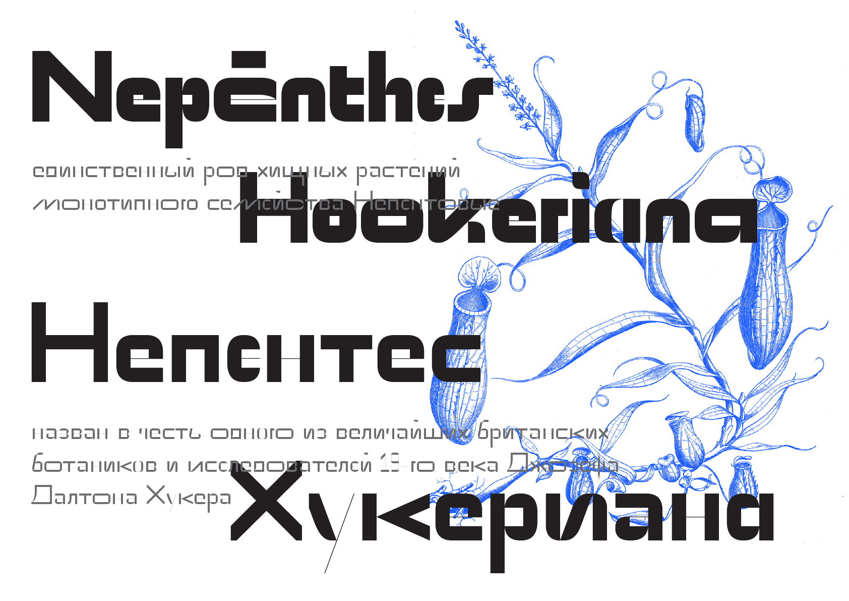
The typeface is built on a modular grid and proudly ignores the rules of optical compensation: horizontal and vertical strokes are exactly the same in thickness, and round and triangular letters do not have droops at all. All these features allow you to work starting with a size of 21pt in print or about 24px on the screen (not retina). Especially the font is revealed in an extra large size.
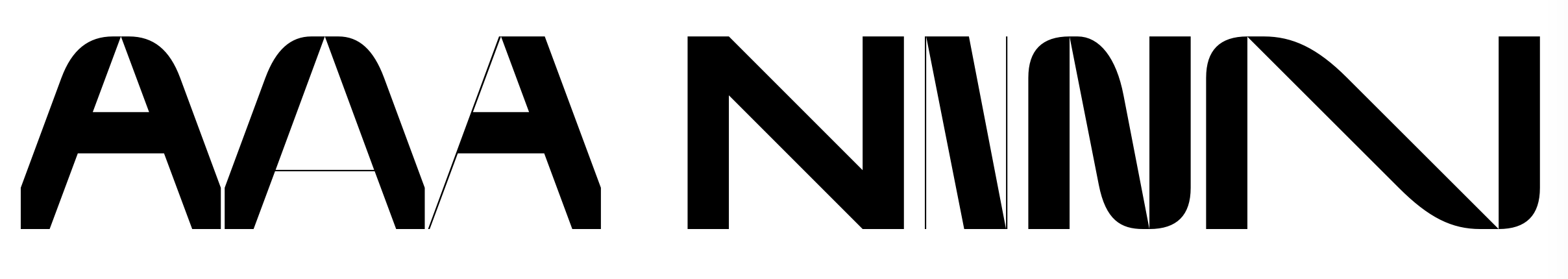
Такая модульная сетка сама провоцирует шрифтового дизайнера на создание такого количества альтернативных форм букв, поэтому остановиться их добавлять было отдельным испытанием. Но самое интересное — это использование всех этих альтернатив.Наглость шрифта проявляется также и в его особых стилистических сетах: сет 01 включает псевдопроизвольную замену большинства букв стандартного рисунка, а сеты 02 и 03 добавляют в цикл замен контрастные альтернативы. Также, все альтернативы доступны для ручного набора через панель Glyphs.
Знаковый состав
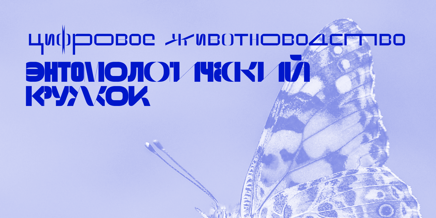
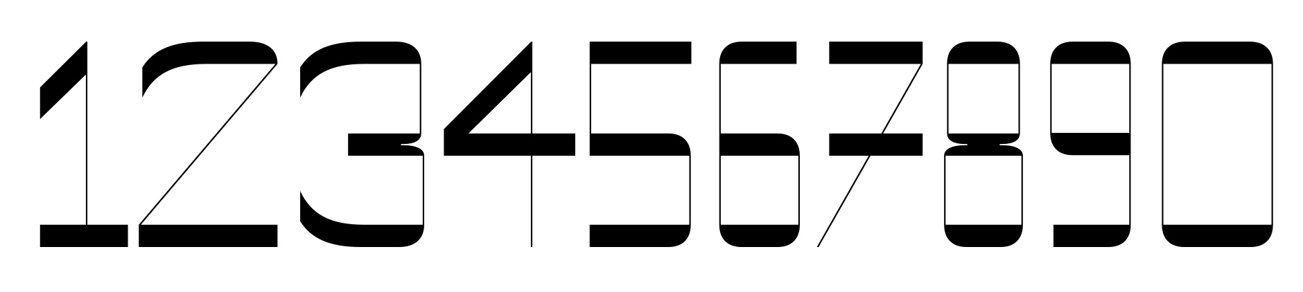
Grrr поддерживает большое количество языков, в набор символов включены расширенная латиница, стандартная кириллица, знаки валют. Цифры в Grrr только одного набора (больше такому шрифту и не нужно), зато у них обратный контраст. Грррр!
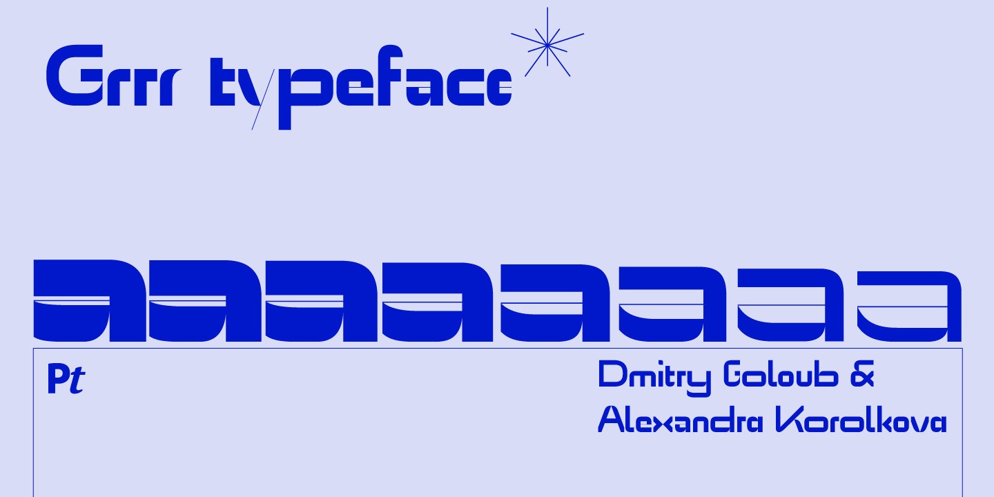
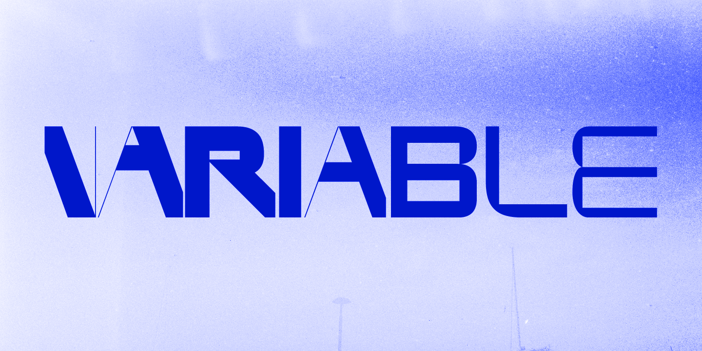
Гарнитура Grrr выпущена в 2019 году в составе 8 прямых начертаний разной насыщенности и в виде вариативного шрифта.
Authors
Alexandra Korolkova
Type designer, book designer, type researcher and type consultant. Art director of Paratype. The 9th recipient of the Prix Charles Peignot (2013). Winner of Granshan, ED Awards, Red Dot.
Leading designer of PT Sans and PT Serif, Circe, Golos, and the new type system of Sber.
Wrote a book on typography for beginners Live Typography (in Russian) which was first issued in 2007 and re–issued in 2008, 2010 and 2012, and a series of type–related articles. Spoke at ATypI, TYPO Berlin, TypeCon, TYPO Labs, Serebro Nabora, Typofest, Typetersburg and others.
Jury member of the Modern Cyrillic type design competition since 2014.
Dmitry Goloub
Graphic and type designer, editor of info.paratype.ru, founder of Bolditalic type school. Previously worked in various design studios and agencies. Designer in Paratype.