This article is a kind of methodological guide. When in doubt, a graphic or web designer can use it to determine the quality of Cyrillic in a typeface, and a type designer will receive tips on how to deal with complicated cases.
Several parameters are crucial when evaluating whether Cyrillic in a typeface is good or bad. These are the design of the letters, their width, the spacing between them and the distribution of stroke thickness. Let’s review them in turn — from general cases to specific notes for each letter.
General glyph design
In Cyrillic, as well as in Latin and Greek, each letter has two variants, or cases — uppercase and lowercase.

Also, the design of a letter changes in italics when we write by hand. In total, there are four basic designs for each letter in Cyrillic.

But only type designers keep that in mind. Why?
When reading, our brain doesn’t analyze each individual letter, but instantly grasps the forms of several characters at once, catches the meaning and moves on to the next combination. For an adult who has been able to read for a long time, all this happens intuitively, that is, unconsciously. So, while reading, people usually don’t pay attention to letter shapes. In addition (and it’s totally confusing), some of the structures coincide in some letters.
This leads to an interesting effect. When a person tries to remember what «basic» letters look like, the lowercase form — the one that we see most often — comes to mind last or does not come at all. Remembering what we constantly perceive intuitively is almost impossible. Therefore, the brain seems to remember the last time it carefully looked at the letters, and it was in childhood, when a person learned to read and write.
That is, if you ask an adult (not a type designer) to write the Cyrillic alphabet «as in a book» or «in lowercase letters», the result will still be uppercase or a mix of uppercase and handwritten shapes.
Therefore, a combination of different forms in one typeface is either a very bold statement or a very clear sign of unprofessionalism. If a typeface looks regular in weight and width and has «basic» letterforms, then different shapes should not be mixed — «б» always with a tail up, «р» always with a tail down, and so on.
In case of a display typeface, mixed forms are okay. With that, there is a need to take a look at the Latin characters. If different forms are mixed in both the Latin and Cyrillic alphabets, then, most likely, everything is in order and this is the author’s idea. And if the Latin alphabet is traditional, and the Cyrillic alphabet is mixed, then perhaps we are dealing with an inexperienced designer’s typeface and it is worth looking for something else.
This article shows the traditional forms of the Russian Cyrillic letters. If you see a text typeface in which most of the characters look like upright italics, it is most likely Bulgarian. In the 1960s Bulgarian designers agreed among themselves to use such letterforms.
So, such typefaces are appropriate for text in Bulgarian. In case of other Cyrillic languages, such letterforms will look strange, and it’d be better to choose a more traditional typeface for long paragraphs.
Italic versus oblique
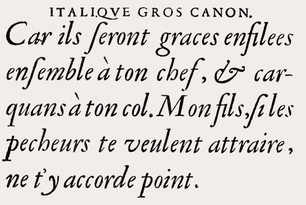
The level of «cursiveness» of the typeface can differ. In Renaissance typefaces, the italic style was very far from upright. In modernist typefaces of the 20th century, following Stanley Morison, Beatrice Ward and others, it became much closer to the oblique style.
Most letters of the Latin alphabet do not change their shape much when switching to italic. In case of Cyrillic, italic characters most often differ from their upright counterparts.

In serif and humanist sans serif typefaces, all this richness works very well. But if а Cyrillic typeface is far from calligraphy, then its italic face can be a hybrid mix of italics and obliques. Moreover, depending on how much the author wants to preserve rigidity and rationality in italics, the number of oblique characters may vary.

Letter width
Letters in most typefaces (except for monospaced) have different widths, some are wider, and others are narrower.
A typeface as of whole can be characterized as narrow, wide, or normal.
With that, in both the narrowest and the widest typefaces the letter «ш» will be wider than the letter «н», and the letter «г» will be narrower than the letter «о». There is an unspoken tradition, which has developed over the centuries of typesetting, of letter widths and proportions.

Of course, there are no exact rules of each letter’s width, but if a typeface is intended for long text, then the letters should seem uniform.
The surest way to deal with letter widths is to look closely at good old typefaces and compare your result with the traditional one. Here is an illustration in which the letters of several popular text fonts are arranged in order — from the narrowest body to the widest.

Widths of display typefaces can be handled much more freely. For example, a popular technique is a strong variance in the width of letters, especially uppercase ones.

One can also significantly widen one or two letters of an inscription. The main rule is that the idea should be immediately visible and obvious, and not look like an accident.
Letter spacing
Letter spacing should look even in a well–made typeface. But letters come in different shapes: rectangular, oval, triangular, even more complex ones. They already have a certain amount of «air» around them.

So, you cannot automatically set the same sidebearings to all letters. Of course, technically you can, but it will turn out just uneven.

When you design a typeface, you must check how each letter fits between two rectangular and two oval ones. In both cases it should turn out even.

But in some letter combinations, it won’t be even, no matter how hard you try. For example, in the word «где» there will be a white hole between «г» and «д», if the typeface has no kerning.

There are also some combinations in which kerning won’t help much. For example, when two letters almost touch each other at the bottom, you get a hole at the top. The most frequent combinations of letters of this type are «кл» and «дл». An experienced type designer is aware of «к» or «д» and «л» pairs and adjusts the shape of the letters to make the hole smaller. Here’s a magic phrase by which you can determine if there is kerning in a typeface and whether its author thought about challenging combinations of letters (it also contains all the most complex letters which we will talk about in the next part of the article).

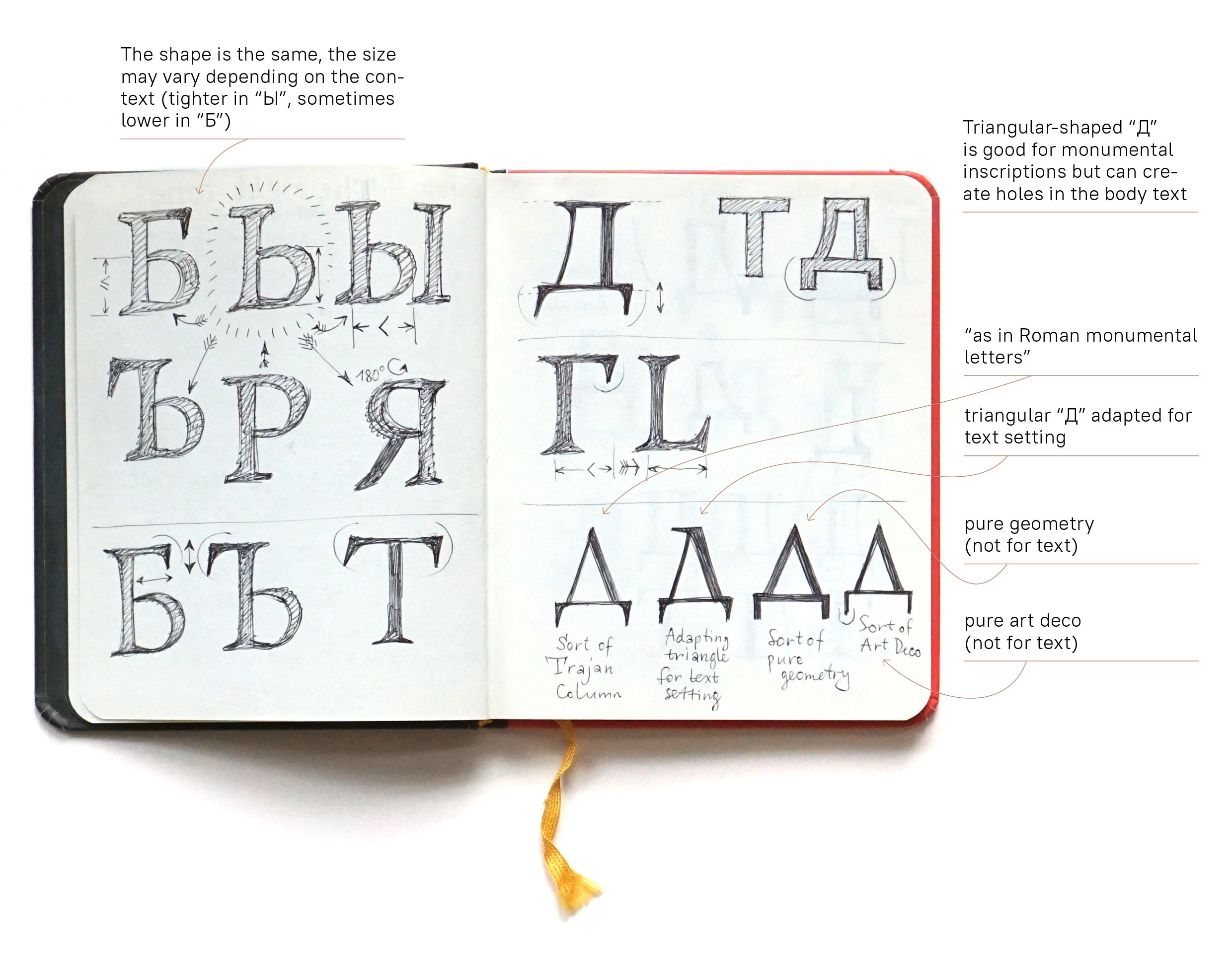
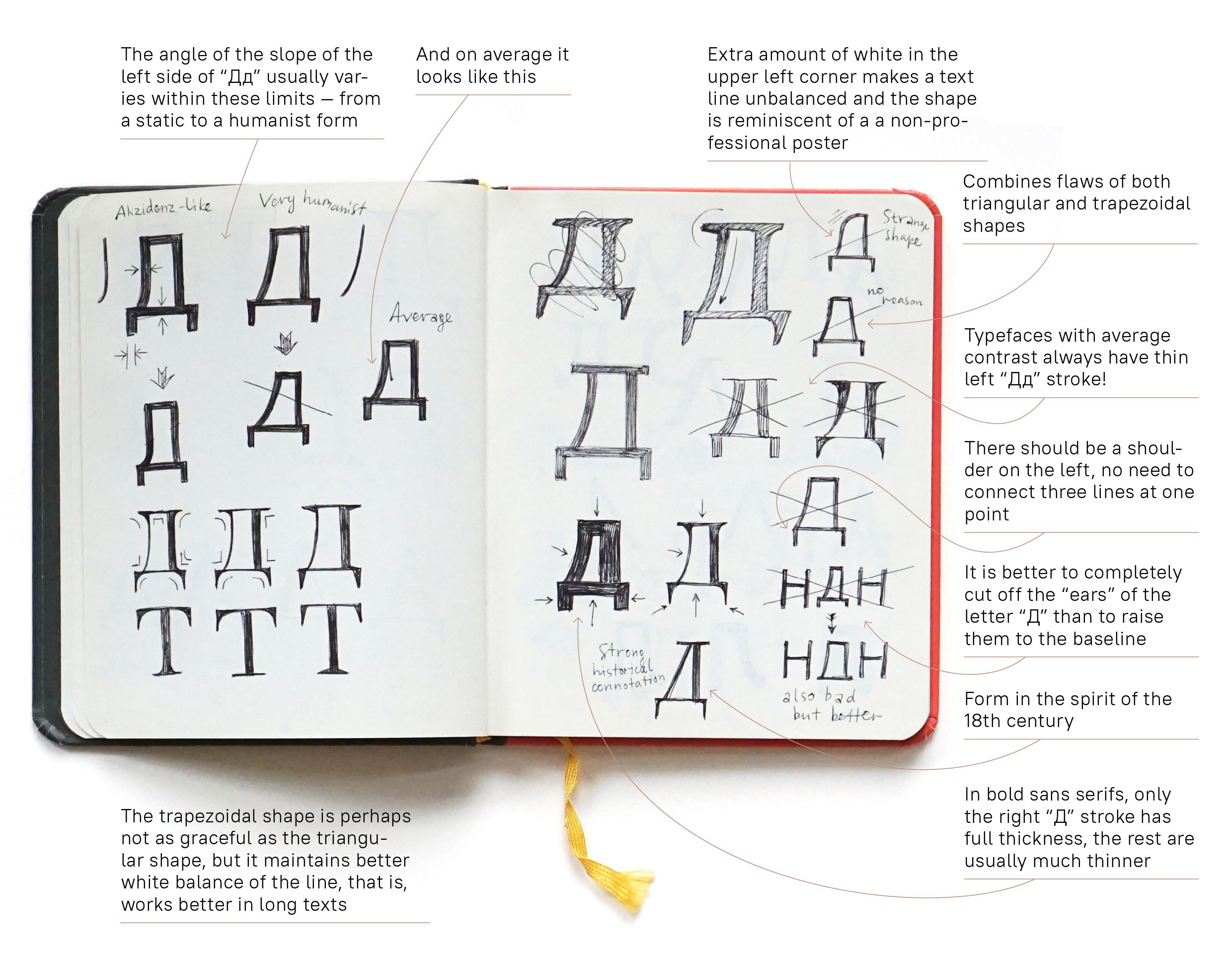
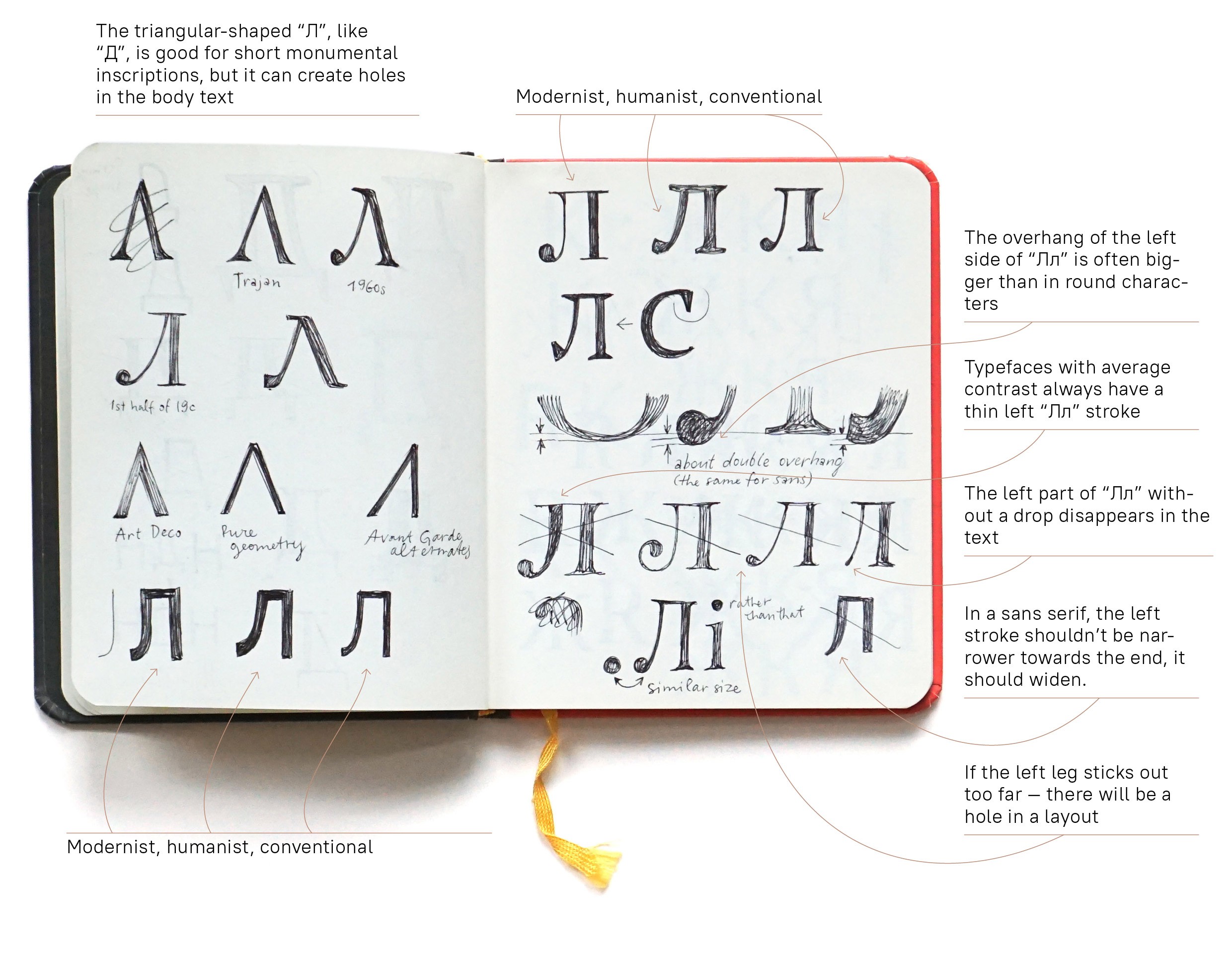
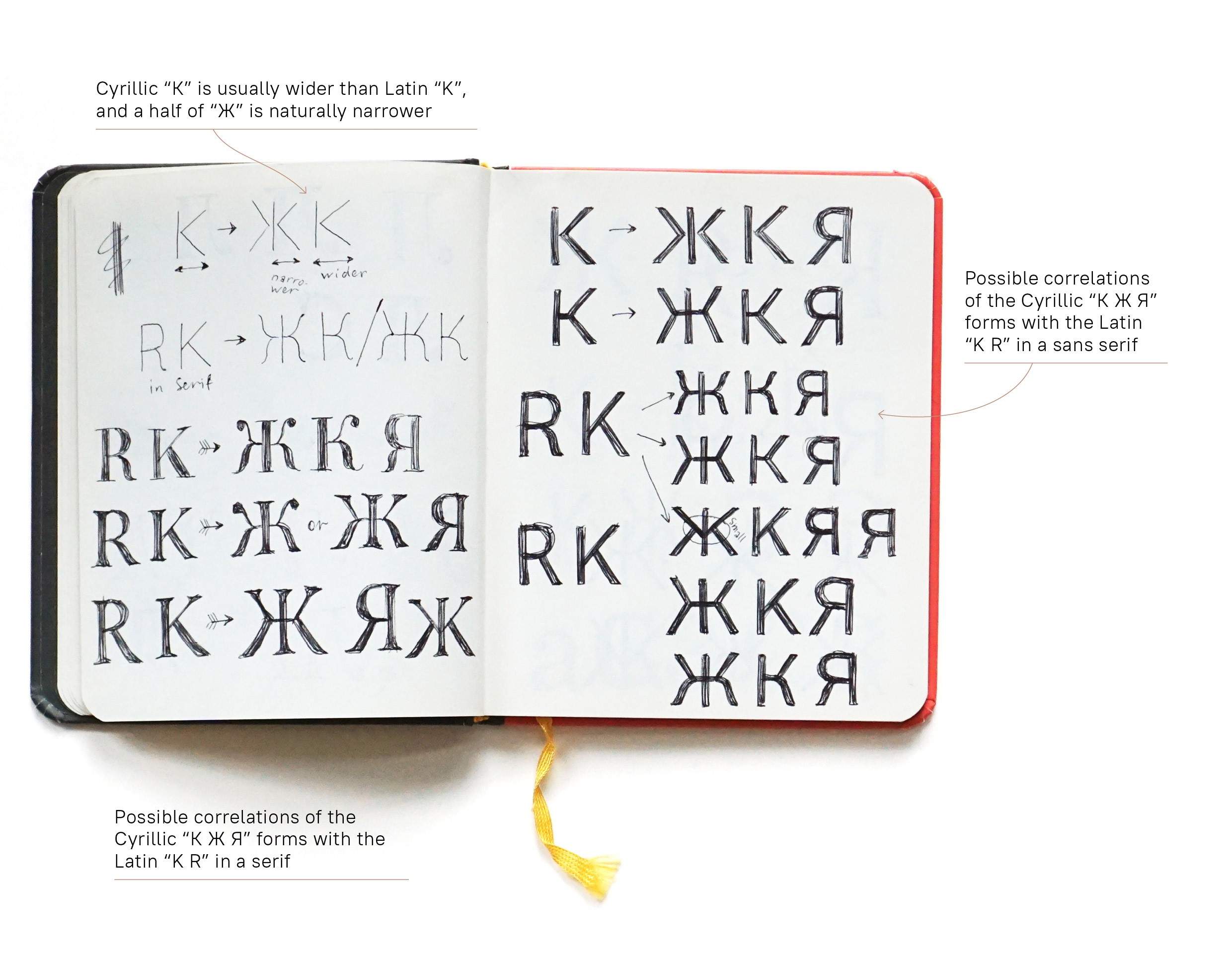
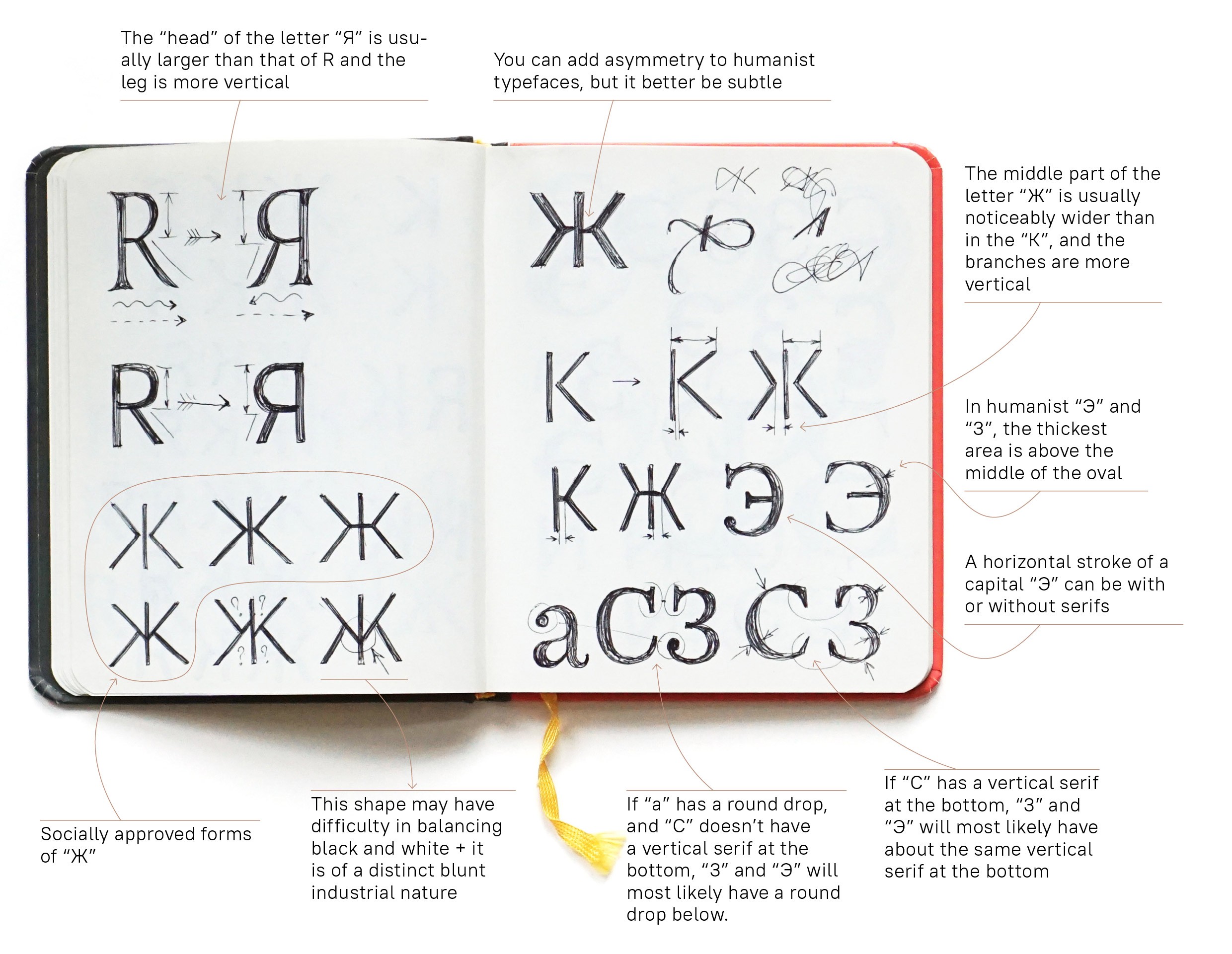
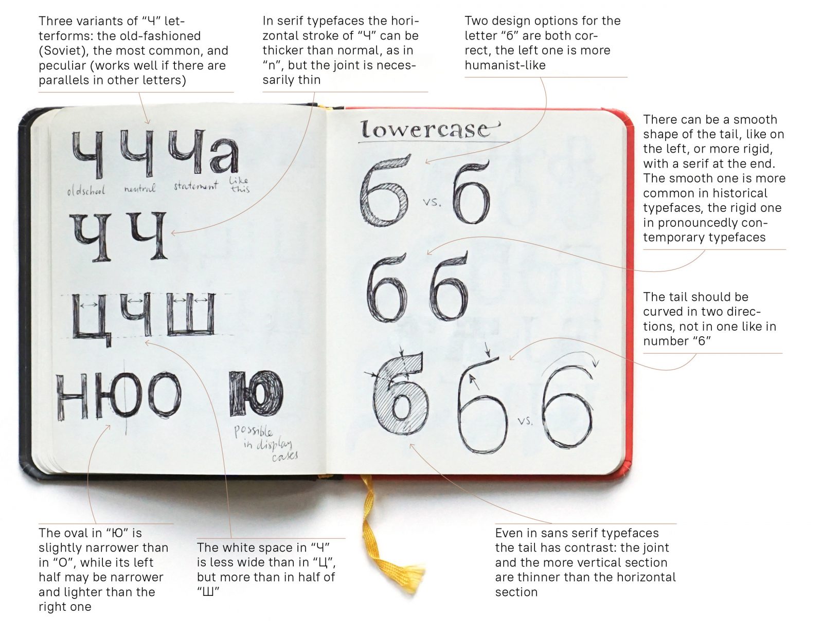
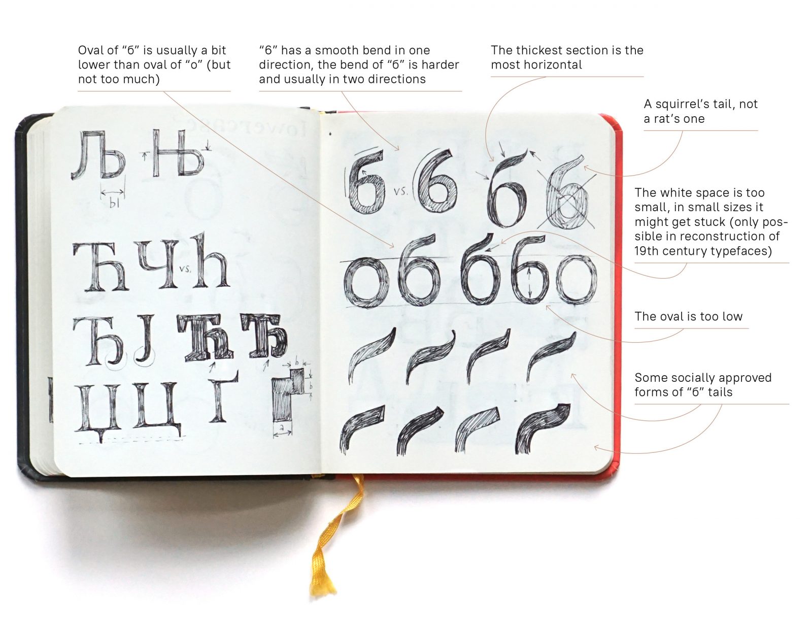
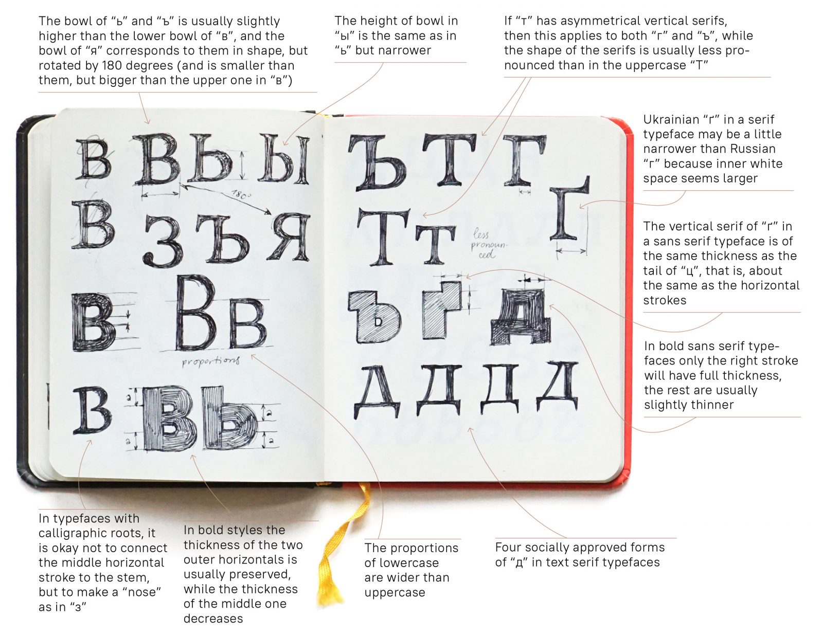
Letterforms and thickness distribution of «complex» letters
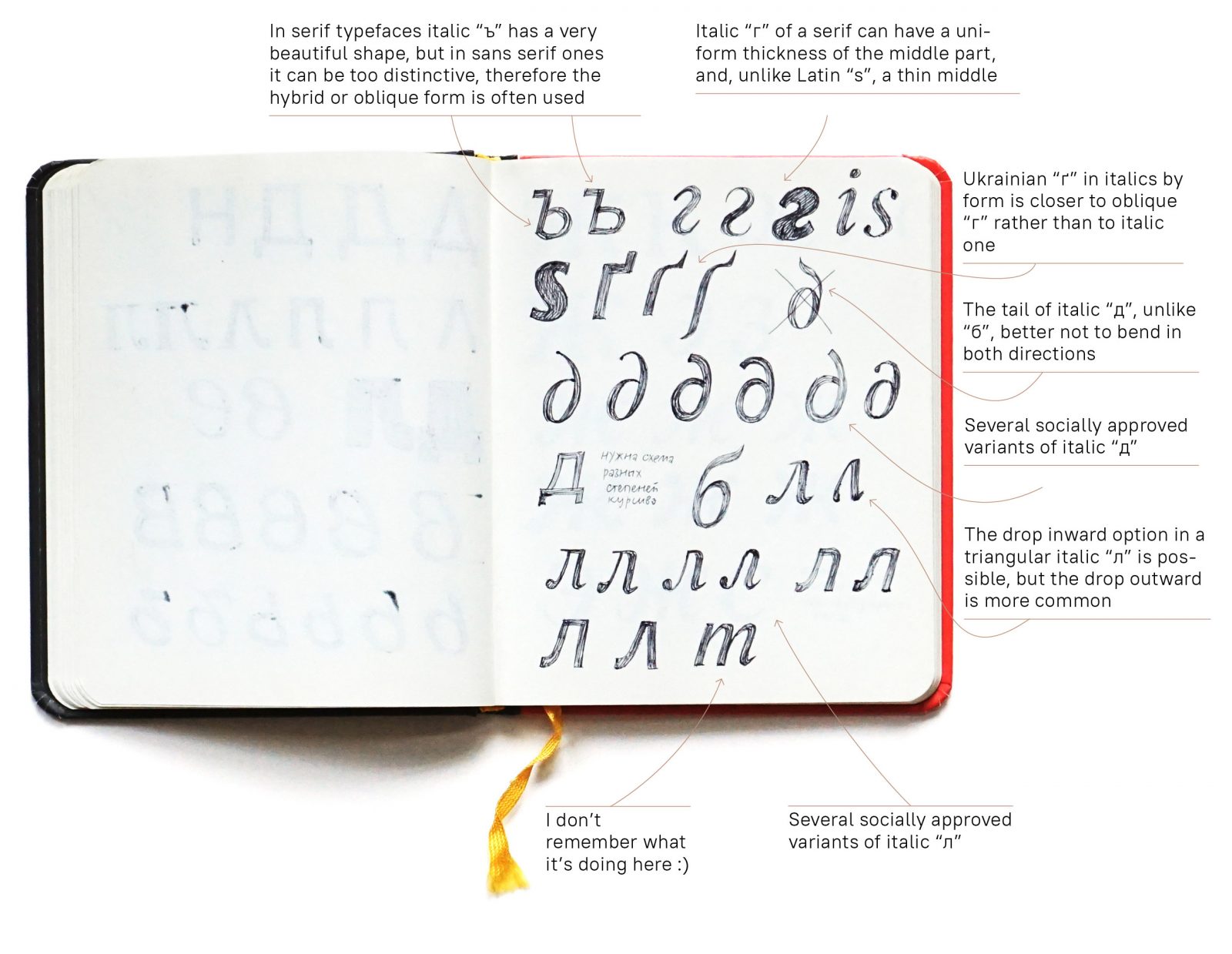
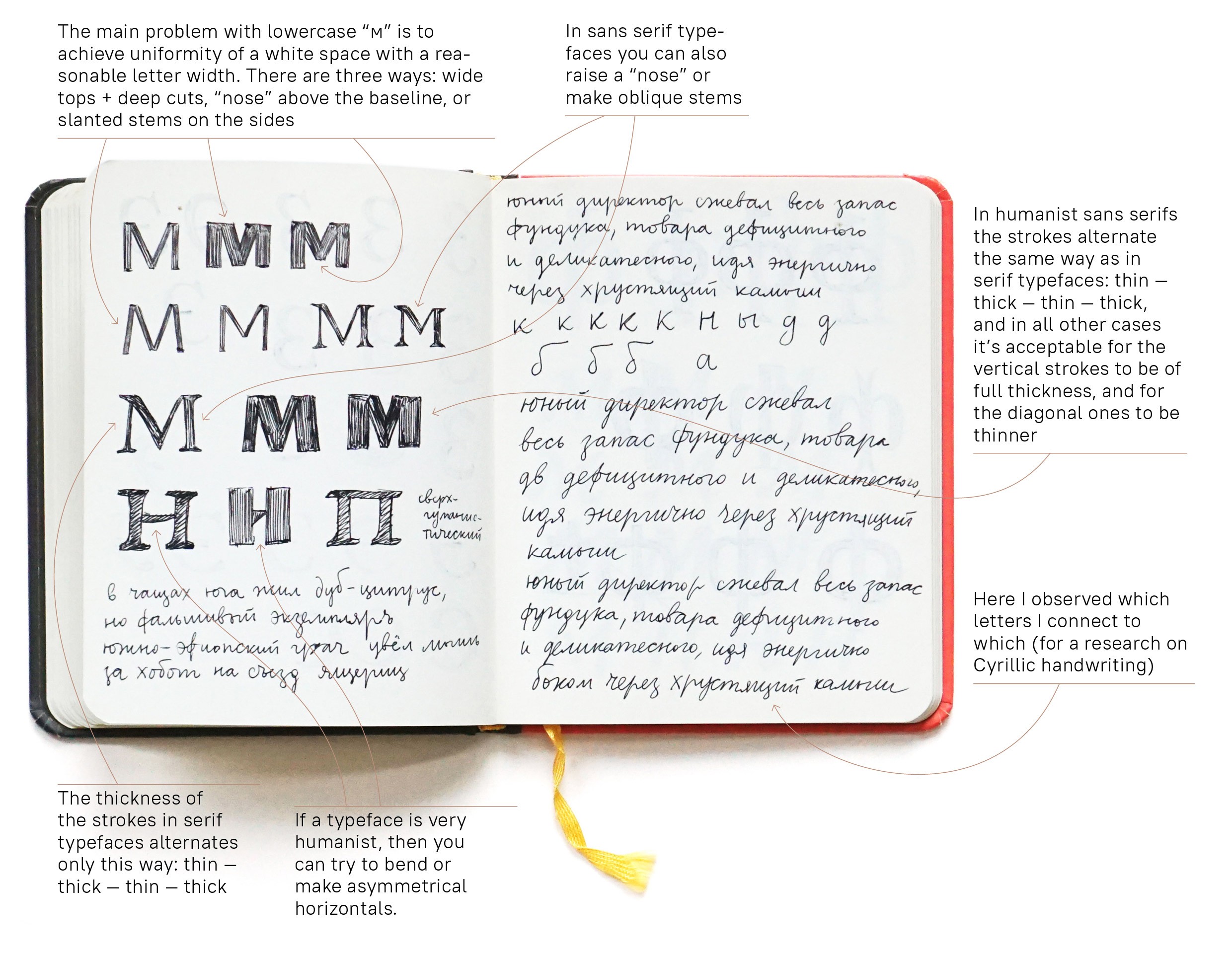
Here are spreads from a «type designer’s notebook» with sketches of different letters and explanations of how they work, which forms are used where, what they mean or what is wrong with some forms.